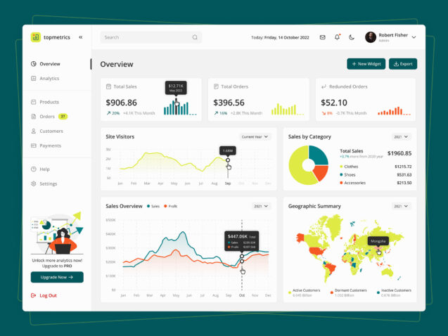
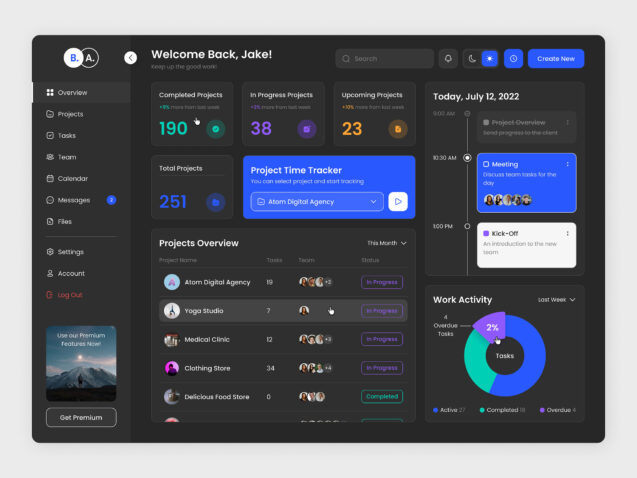
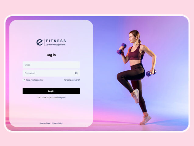
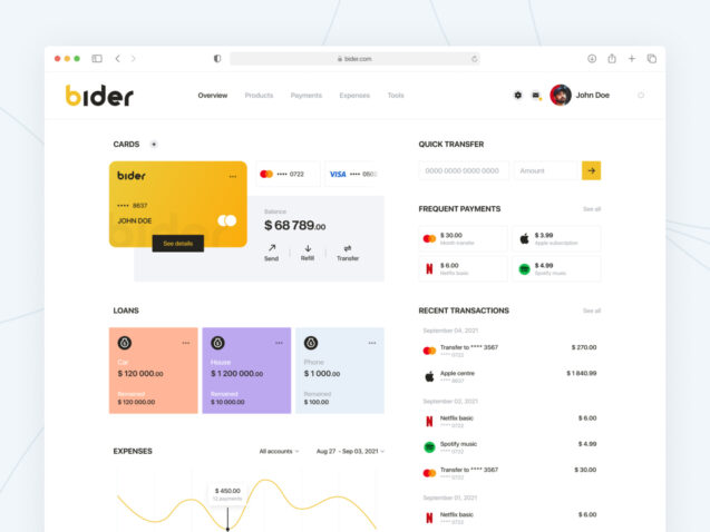
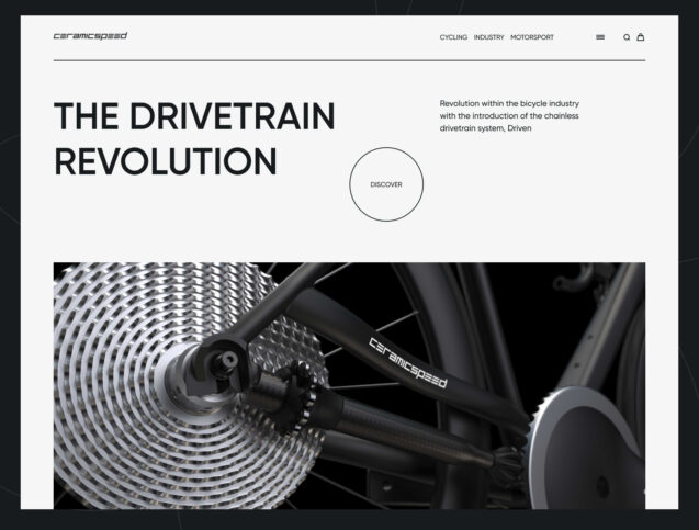
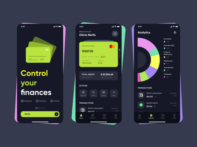
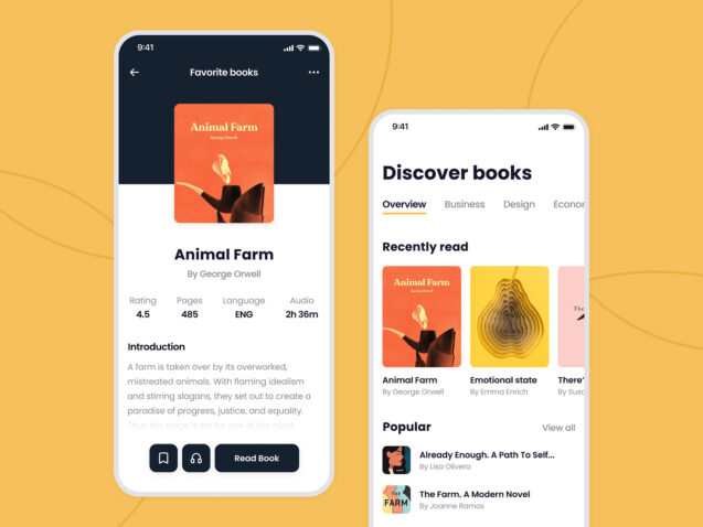
Delivering exceptional digital products requires a deep understanding of design principles, methodologies, and techniques. User experience (UX) and user interface (UI) design play crucial roles in creating intuitive and visually appealing websites and apps. At Elinext, we leverage these principles and techniques to deliver best-in-class solutions tailored to the specific needs of each product.
UX design focuses on enhancing the interaction between users and the product. It involves understanding user behavior, conducting research, and creating user flows and wireframes to optimize the overall user experience. UI design, on the other hand, encompasses the visual elements of the product, such as colors, typography, layout, and branding, with the aim of creating an aesthetically pleasing and engaging interface.
In our articles, we delve into the fundamentals of design principles, explore Jakob Nielsen’s Heuristics, and discuss methods for measuring design effectiveness. We also cover reading patterns, laws that dictate the maximum length for numbers, and guidelines for element placement relative to the user’s cursor. Additionally, we touch on composition techniques, color palettes, and the application of gestalt principles in design.
What is the difference between UI and UX?
UX (User Experience) encompasses the entire user journey and interaction with a product or service. It includes all aspects of their experience, from accessing the product to performing tasks and achieving their goals. For example, if many users prefer to log in using their Google account, it’s important to provide a simple and easily accessible option for them to do so. This ensures a seamless and hassle-free login experience for users.
On the other hand, UI (User Interface) focuses on the visual and interactive elements of a product. It encompasses the graphical layout, including buttons, text, images, sliders, and text entry fields, among others. A key aspect of UI design is ensuring users can easily understand and interact with these elements.
For instance, in the case of providing a login option via a Google account, UI designers should create a visually distinct and recognizable button that clearly signifies its purpose and leads users to the login process.
UI design also involves aspects such as screen layout, transitions, interface animations, and micro-interactions. Every visual element, interaction, or animation within the user interface must be carefully designed to enhance the overall user experience.
Jakob Nielsen Heuristics as measurements in the design
Jakob Nielsen’s heuristics consist of 10 general principles developed in the 1990s for interaction design. These heuristics are known as “rules of thumb” rather than specific usability guidelines. They provide a high-level framework for evaluating and improving the user experience of digital products.
Principle 1: Visibility of system status
Users should be consistently provided with relevant feedback within a reasonable timeframe, ensuring they are well informed about the status of their actions or processes within the design.
Below is an example of using this rule in real life. “You are here” users can find where he is and locate other items on the map.
Source: behance
An example of using the rule in one of our projects is navigation. It shows the current location of the user.
Source: dribble
Principle 2: Ensure the system matches the real world
Design should be aligned with the users’ understanding and language. This means using words, phrases, and concepts that are familiar to them instead of relying on technical jargon or internal terminology. Following real-world conventions and presenting information in a natural and logical order further enhances the usability and accessibility of the design.
The user should have the possibility to compare design items with items in real world
Source: shopify
A shopping cart in the online store is similar to a real-world shopping cart
Source: dribbble
Principle 3: User control and freedom
Users can sometimes unintentionally perform actions that they didn’t intend to. To address this, it is crucial to provide a clearly marked “emergency exit” option that allows users to quickly and effortlessly exit any unwanted actions or processes, it shouldn’t be a complicated procedure.
Digital spaces should have an “emergency exit” like in a real-world
Source: hbr
The user should have the option to come back to the page where he was last time. It can be a “back” button or, as in an example, use the menu as an exit.
Source: dribbble
Principle 4: Consistency and standards
Users should be able to easily understand the meaning of different words, situations, or actions in the design without any confusion. To achieve this, it is important to follow platform and industry conventions, ensuring that commonly used terminology and conventions are utilized. Consistency in language and design elements helps users navigate and interact with the product intuitively, without the need for additional explanation or guesswork.
Check-in counters are usually located at the front of hotels. This consistency meets customers’ expectations
Source: pond5
In the apps, the user wants to see the “Sign Up” button or link next to the “Sign In/Login” button.
Source: dribbble
Principle 5: Error prevention
While effective error messages are valuable, the best designs focus on proactively preventing problems from arising in.
Marks on the rails prevent users from mislead
Source: wallpaperflare
Field mask helps the user to understand what type of data he should put in. To make a transfer users should provide a card number. How many characters should be provided the user can see on in the field.
Source: dribbble
Principle 6: Recognition rather than recall
Reduce the cognitive load on users by ensuring that elements, actions, and options are always visible. Users should not be required to remember information across different parts of the interface. All necessary information, such as field labels and menu items, should be easily accessible or retrievable whenever needed.
People are more likely to correctly answer the question Is BigBang located in London? rather than Where’s the BigBang located?
Source: planetofhotels
The header in most of websites is located at the top of the screen, and the user tries to find it at this position
Source: dribbble
Principle 7: Flexibility and efficiency of use
To cater to both inexperienced and experienced users, consider incorporating shortcuts that are hidden from novice users. These shortcuts can help speed up interactions for expert users. Additionally, allow users to customize and personalize frequent actions according to their preferences.
Maps typically display regular routes, but individuals familiar with the area often opt for shortcuts based on their local knowledge
Source: vocal
Welcome wizard or onboarding can show the user how to use app, but if the user already knows this information he can skip it
Source: dribbble
Principle 8: Aesthetic and minimalist design
Avoid including irrelevant or rarely needed information in interfaces. The presence of any extra information in an interface directly competes with the relevant units of information and reduces their visibility in comparison. Therefore, it is important to prioritize and only display the necessary and pertinent information to ensure optimal visibility and clarity.
Skeuomorphism was created when the touch screen was developed to teach users how they can interact with these screens. For now, everyone using these screens, and designers can simplify web site’s items to concentrate user’s attention on the content
Source: wired
Source: dribbble
Principle 9: Help users recognize, diagnose, and recover from errors
Error messages should be communicated using plain and straightforward language, without the use of error codes. They should accurately and precisely indicate the specific problem encountered and also provide constructive suggestions for resolving the issue or finding a solution.
Signs on the road with “wrong-way” messages serve as a reminder to drivers that they are traveling in the incorrect direction and request them to cease their current course.
Source: unsplash
Principle 10: Help and documentation
Ideally, a system should be self-explanatory and not require any additional clarification. However, in certain cases, it might be necessary to offer guidance to assist users in understanding how to complete their tasks effectively. This guidance can help users navigate and successfully accomplish their goals within the system.
Information kiosks at airports are easily recognizable and solve customers’ problems in context immediately
Source: unsplash
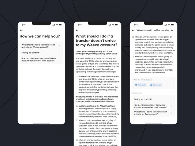
Here the user can get access to the documentation, also the designers can let users write to support and get help
Conclusion
In our article, we delve into the fundamentals of design principles, explore Jakob Nielsen’s Heuristics, and discuss methods for measuring design effectiveness. It aids in the identification of mistakes and misleading aspects prior to product launch, which in turn reduces the need for extensive usability testing efforts. This proactive approach allows for the early detection and resolution of issues, resulting in a streamlined and more efficient testing process.
By adhering to these principles and employing proven methodologies, we ensure that design solutions are user-centric and optimized for usability. Continuously evaluating and refining designs allows us to deliver innovative and intuitive digital experiences that captivate users.


