Most people make the mistake thinking design is what it looks like. People think it’s this veneer – that the designers are handed this box and told, “Make it look good!” That’s not what we think design is. It’s not just what it looks like and feels like. Design is how it works.
– Steve Jobs
The epigraph is basically one of the most comprehensive and accurate definitions of what design is. If you try to shorten it to several words – design is about how something looks, feels, and works.
Even referring to the very theoretical definition we found in Cambridge Dictionary, it will be very similar to what Steve Jobs said: “a drawing or set of drawings showing how […] a product is to be made and how it will work and look.” A lot of other sources will provide the same essence of design, consisting of three main components – how things look, feels, and work.
Moving to the question of whether startup companies need design, we will refer to some facts, statistics, researches, and live examples.
Thus, under McKinsey Quarterly, design is more than a feeling: it is a CEO-level priority for growth and long-term performance. This is true that in most cases it is hard to estimate the business value of design immediately. Therefore, McKinsey conducted extensive research on whether and how design influences business metrics including revenue and returns. The report made in the result of the research clearly shows that design has a direct and large influence on business success, metrics and, that is why it should be CEO-level priority.
The data on business value of design received by McKinsey in the result of the research was also supported by a number of researches conducted by other companies. As InVision research claims, good design increases a company’s revenue and tends to increase shareholders’ returns at nearly twice compared to the industry competitors which do not pay attention to design (or have poor design).
At this point, you might find that the above-mentioned reports analyzed only medium or large business companies which have huge budgets on the design and those reports do not concern small startup companies, especially at the very early MVP, pre-seed, or seed stages. Moreover, analyzing a number of greatest and largest companies which were small startups some time ago, we can tell that at least one of the founders of those companies was a designer or had some design expertise. Among those companies are Pinterest (Evan Sharp), Instagram (Mike Krieger), YouTube (Chad Hurley), and Airbnb (Brian Chesky).
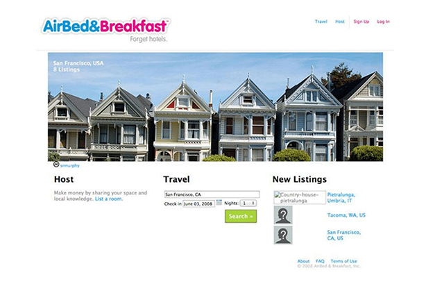
Let’s be honest, the products not always did look good, especially at the very first stages. Here is Airbnb front-page image at the very early stages of startup:
Figure 1. AirBed&Breakfast
Obviously, Airbnb today and in 2007 have absolutely different interfaces. And now, you can say “Look, Airbnb had no design and notwithstanding the lack of design became one of the greatest companies on the market”.
However, we need to remember several things. Firstly, design is not only about how things look and feel, it is also about how things work. Secondly, at each separate stage business needs different scope of design work. Thus, although a company can need a different scope of design on each of its life stages it needs it anyway.
So, do startups need design? Or, let’s put it in another way: Do startups need design to succeed?
The answer is yes, absolutely, and at all the stages of the startup lifecycle.
At the ideation, stage designers speak with users asking correct questions to identify their objective problems and design effective solutions. When user’s problems and needs are met, we start designing a solution with minimum necessary features keeping in mind the scalability of the product – design.
After Minimum Viable Product (MVP) is launched and first clients start using the product designers start usability and A/B testing, get analytical data, and improve the design according to the data received in order to improve KPIs. Then, the design team constantly improves the usability of the product, integrates new features to the product, designs it scalable, etc. The main role of the design team will be not to paint a beautiful image but to create an effective easy-to-use solution with a beautiful and appealing interface.
Here, in Elinext, our design team has a business mindset and clearly understands that the operating product is better than non-operating but containing beautiful images. Functionality and convenience are more important than visual appearance (content is more important than the form). Thus, when we create products for our clients we keep in mind that the ideal product is:
- operational;
- functional;
- convenient;
- clear;
- visually attractive.
To sum up, if a startup company or any other company wants to succeed, increase revenue, return on investment (hereinafter, ROI) or improve any other KPIs, design is absolutely necessary for this company.
Research and User Experience Design
Now when it is clear that any company, including startups at early stages, needs the high-quality design to succeed we can speak about the specifics a bit.
Basically, the ideal cycle of product creation includes the following stages:
- user experience (UX) design;
- wireframing;
- user interface (UI) or visual design;
- programming;
- quality assurance (QA);
- customer support;
- constant improvements.
The first stage can generally be covered by UX design and includes the very beginning. Understanding problems your users face and your product solve with the help of a number of techniques and methods of UX research, including qualitative and quantitative types of research, and some artifacts such as user stories, personas, customer journey maps, etc. When you create a new product or on the stage of improvements of the operating product, you need to check a large number of hypotheses and assumptions to improve your metrics and/or find your “Holy Grail” – product-market fit (hereinafter, PMF). This where design comes to the rescue with its different UX research techniques, types, and methods.
Let’s dive a bit deeper with the latter and take a look at some examples.
What is UX Design and why do you need it?
UX Research is a systematic process aimed at the learning and understanding of users’ behavior, their needs, and motives of one or another behavior, with the help of different research methods and techniques. Basically, when your company is in the very beginning of its life, it needs UX Design is to avoid the widespread situation of creating a product for yourself. For MVP and the products that already successfully operate on the market, need UX Design, respectively, to attract and retain users, or to improve already high KPIs.
Thus, in case you did not attract a designer to work with your product, you’ll face the situation when you won’t be able to attract and/or retain users, hence, won’t be able to improve KPIs. This is supported by a large number of researches in the area of influence of design on business metrics. For example, according to the research by AppDynamics, 86% of US users stops using the app because of its bad performance. The design of the App, both visual and its user experience design, directly influences how users perceive the app’s performance and evaluate their experience using the app. On average, 88% of users will less likely return to a website after a bad experience.
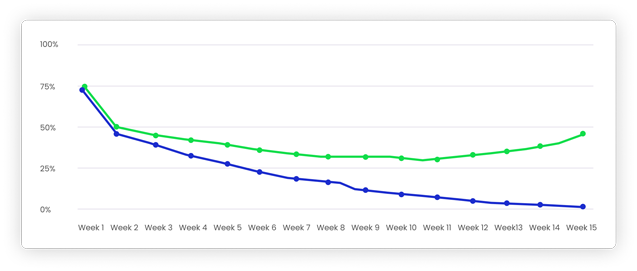
Below is the example of the chart which shows how such an important metric for a startup like PMF behaves depending on how good the design is. The green line illustrates a good example of PMF of a product that was carefully designed both from a visual and usability perspective, using UX design techniques. The blue one shows what happens with PMF of a product without design.
Figure 2. Product Market Fit Example. Data source: Y Combinator
The forms of UX research include:
– Preliminary Research. This will be applicable when we need to find an answer to the question – which problem do we solve from a user perspective and from a business perspective;
– Primary forms of research:
- User Interviews;
- Focus Groups. The specific of this form of quantitative research is that you get a lot of data for a short period of time;
- Usability Test. This is qualitative research based on asking a user to complete certain tasks using your product with the goal to reveal pitfalls and sticking points in your product that impair usability;
- Guerilla or Corridor Testing;
- Surveys;
- A/B Tests. Basically, the A/B test allows you to understand which of the several solutions, A or B, works better.
– Secondary forms of research. One of the most widespread types of secondary research is Desk Research. Basically, this is the research which can be conducted by yourself sitting at the desk. Namely, this includes analyzing books, articles, reports, existing products in the industry, etc. An obvious advantage of this type of research is that it is fast and cheap.
Below we’ll provide several examples of when different forms of UX and/or UI design helped to increase some important metrics:
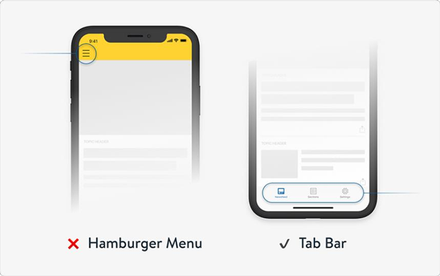
1. One of the global media companies. At some point, the company understood that it was a rather rare case that users navigated to different parts of the app. Users did not navigate to the sections to which the company wanted them to navigate. Instead of that, users quickly read the titles of the section they get in and closed the app. Finally, the company held usability tests and interviews. As a result, it became obvious that users, actually, are very interested in the content, however, they did not know how to find it because it was hidden in the so-called “burger menu”. Finally, the burger menu was replaced with a tab bar in the app.
Figure 3. “Burger” vs. Tab Bar
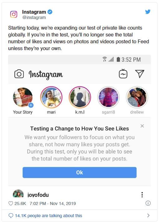
2. Instagram. The guys on Instagram had a hypothesis that users post content of low quality and still manage to get a lot of (presumably artificial) Instagram likes. That, in turn, makes other users put even more likes for low-quality content. Then, they’ve decided to test the solution and hid for some users the number of likes from those user’s followers and visitors. So, they checked the hypothesis conducting A/B tests, meaning some of the users are shown one user interface (with likes in this specific case), and the other users see an alternative version of the interface (with hidden likes).
Figure 4. Instagram A/B tests
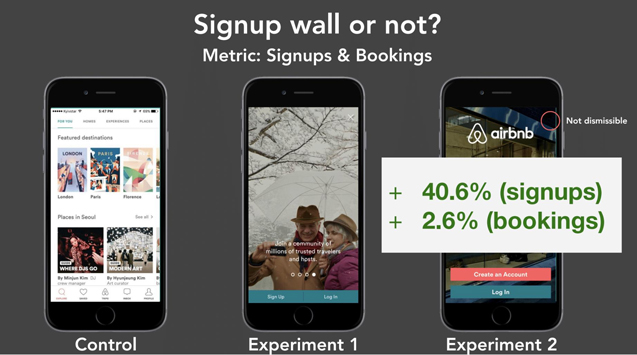
3. Airbnb. The company wanted to increase such metrics as the number of signups and bookings. They made an assumption of making the last screen of user onboarding not dismissible and allowing only two options for users – Create Account and Log In. In order to check that hypothesis, they conducted A/B tests. Again, for some users they showed one version of the interface (users could proceed to the app without login or registration), the others saw the version that did not allow users to enter the app without a log in or registration. As the result, the metrics were increased.
Figure 5. Airbnb. A/B Tests. Source: Y Combinator
Finalizing this section about user experience design, we would like to mention that:
- it is necessary to conduct research and its different types, including usability and A/B tests, interviews;
- while conducting interviews and checking your ideas, it is always much more effective to visually demonstrate something than to describe verbally;
- it is always a good idea to use call-to-actions (CTAs) in your interface, tell users what you expect them to do;
- one of the basic usability rules – do not make users think, follow “KISS” principle which stands for keeping it simple;
- “less is more” – remove all the unnecessary things;
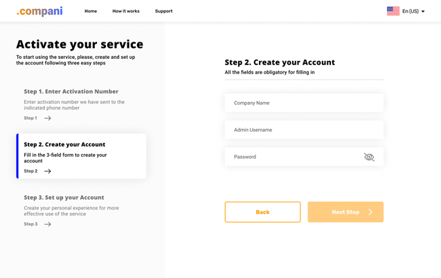
- in case there’s no way to simplify some complex user flows in your product, nothing to remove – separate this flow into small clear steps, reduce cognitive load;
Figure 6. Separate complex flows into small clear steps, reduce cognitive load
- remember, that ideally, one screen should include only one main action user should undertake;
- navigation is always the basic core thing on your product, navigation should be as simple and clear as possible;
- users always should clearly understand where they are in the app right now & have full control over the app.
UI or Visual Design
When the necessary level of UX design is reached you can proceed to the visual design. Visual design is about such things as “what user should pay attention to”. In this section, we will briefly describe some basic rules of UI Design with examples. They are:
- Contrast. The latter is necessary to display the most important things on the screen. Some of the techniques for demonstrating contrast are color, size, boldness;
- Hierarchy. Having a good hierarchy on the screen will make content more readable & scannable. Some of the basic rules for having a good hierarchy are if some elements on the screen are closer to each other that means they are interconnected and build one section; using white or negative space – makes information easier and quicker to perceive;
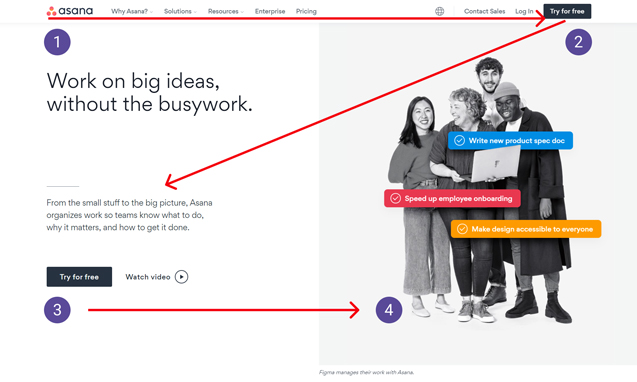
- Z-Pattern Layout. People used to scan pages and screens the way they read books. For most languages this is the so-called Z-pattern; for right-to-left languages, the pattern will look like reverse Z;
Figure 7. Z-Pattern Layout. Screenshot: asana.com
- Minimalism. Frankly speaking, this is not a principle but more a trend or direction in design. Minimalism, as co-founder of Y Combinator, Paul Graham, admitted, is about being simple and “when you’re forced to be simple, you’re forced to face the real problem. When you can’t deliver ornament, you have to deliver substance”.
Conclusion
Silicon Valley’s New Secret Weapon: Designers Who Found Startups
If you want to ship great products consider having a designer in
your founding group.
– Fastcompany
Concluding, we approve the statement that any business needs design, including startups even at very early stages. The reason behind it is that design is not just about beautiful images, it is about the solution to your end-users problems. Studies agree with the fact that design has a direct influence on business success and main KPIs. With an adequate website prototyping and testing f.e. on Figma, visually appealing interfaces, high-quality UX design will make your product the product people love to use and advice to their friends, the product which brings your company up.
Find more information on effective UI/UX in our previous articles:
