In this final article of the “Design Principles” series, we will discuss the important role of typography and color in design.
Typography involves choosing and arranging typefaces to enhance readability and create visually appealing designs. It includes selecting the right typeface, font size, spacing, and hierarchy. Similarly, color selection and usage are crucial for evoking emotions, establishing visual hierarchy, and improving the user experience. Both typography and color are essential elements of UX/UI design services. You can find more information about UI in this article.
Typography
Typography encompasses arranging text’s aesthetic and functional elements, utilizing various fonts, symbols, and characters. It goes beyond simply selecting an appealing font, as its effective use can improve user experience, legibility, inclusivity, and visual organization within a design.
Hierarchy
Almost all interfaces contain some form of textual information. Implementing hierarchy in typography assists in enhancing the ease of scanning and legibility of an interface, allowing users to locate essential information more efficiently.
Designers opt for larger and bolder text to highlight crucial information, as it naturally attracts the attention of users’ eyes. While smaller and lighter text is more suitable for less significant content.
Line height and line length
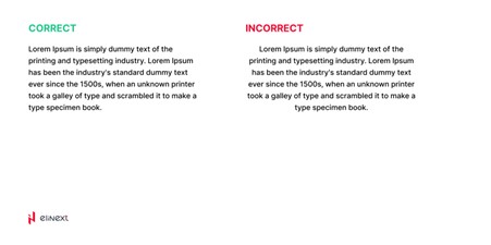
Maintaining appropriate line height and width is crucial in ensuring the legibility of text across various device sizes.
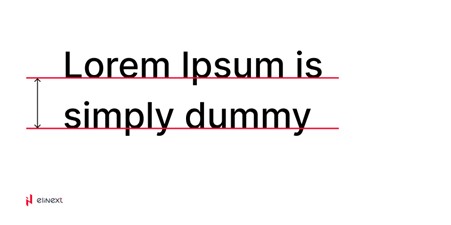
Line height refers to the spacing between the baselines of text lines within a paragraph, which determines the distance between the invisible lines on which the letters appear to rest. Line length, on the other hand, measures the width of a block of text, typically expressed in inches or points, or as the number of characters per line.
Source: dribbble
Line height
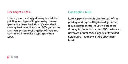
To ensure readability and accessibility, it is recommended to set the line height between 130% to 180% of the font size, depending on the amount of text. Consequently, larger text blocks require a larger line height.
In design and typography, considering line height is crucial during the typing process as it significantly affects legibility and visual appeal. Adequate spacing enhances the readability and overall aesthetic of the text.
Line length
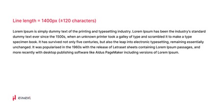
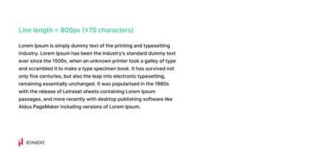
For optimal readability, the recommended length of text is typically between 70 to 80 characters. Within this range, users can comfortably read an entire line by simply moving their eyes. However, if a line exceeds 80 characters, users may need to move their heads to continue reading. This head movement can lead to increased difficulty and potential user frustration in comprehending the text, ultimately resulting in a higher chance of comprehension failures.
Readability
To ensure that typography is accessible and easily readable for individuals with disabilities such as color blindness, vision impairments, and hearing disabilities, it is crucial to adhere to the Web Content Accessibility Guidelines (WCAG).
Here are some essential tips to consider:
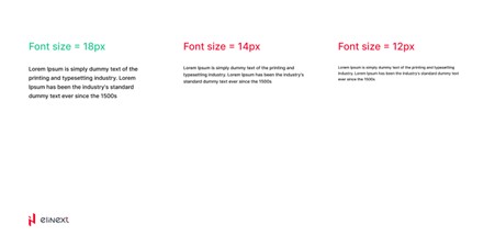
Maintain a minimum font size of 16px or larger for general text, avoiding smaller sizes like 12px to 14px used for additional information.
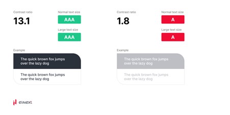
Ensure a color contrast ratio of at least 4.5:1 between foreground text and background colors.
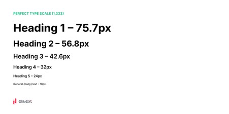
Follow a commonly used scale ratio for font sizes, such as 1.250x, 1.414x, 1.5x, and 1.618x, where each subsequent font size is smaller than the previous one according to the specified ratio.
Number of typefaces
It is advisable to limit the usage of fonts or typefaces to a maximum of three within a single project. Instead of introducing new fonts, utilizing font families is recommended. Font families are designed to complement each other, ensuring flexibility and consistency throughout the interface.
Moreover, in many projects, readability concerns can be effectively resolved by utilizing a single typeface with multiple font families. This approach maintains a cohesive visual aesthetic while addressing readability requirements.
Here is an example of how we are using only one typeface with several font families
Source: dribbble
Words and phrases
- Avoid jargon;
However, if an application is designed for experts it’s possible
- Align text to the left side;
But, if the line count is less than three it’s possible. In general left alignment is more common (the exception is Arabic with right-to-left writing, which use right alignment)
- Gestalt principles are first;
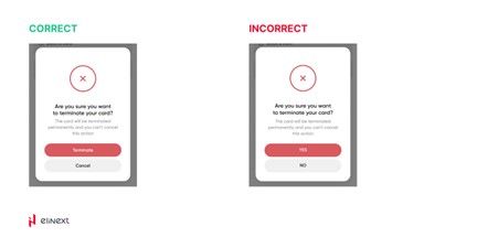
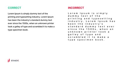
The users link letters in words, words in the line, lines in paragraphs, etc. (space between letters should be less than between lines)
In one of our projects, you can find examples of how we use such tips in real life.
Source: dribbble
Color principles
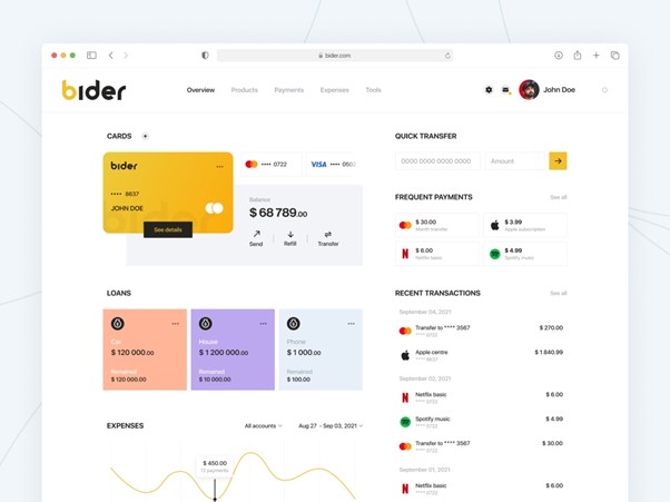
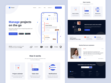
Another crucial aspect is the readability of text on a webpage. As you may have noticed, the text in this article is effortlessly legible, while the images are vibrant and colorful. This indicates the significance of the colors utilized in the interface, as they provide substantial information much like everything discussed earlier.
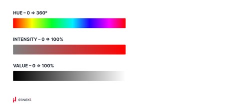
Our understanding of color is built upon a foundation of color terminology. Concepts such as hue, tint, and shade serve as valuable tools we can utilize to craft distinctive color palettes.
Hue
Hue is a technical term used to describe the specific color itself. It refers to the base color without any addition of white or black.
Saturation or Intensity
Saturation refers to the brightness and intensity of a color. Colors with high saturation are vibrant and vivid, while those with low saturation appear more muted and dull.
Value
Value pertains to the lightness or darkness of a color. It indicates the amount of light reflected by the color.
Limit color
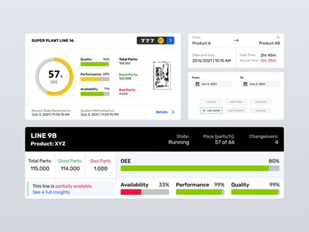
By employing a restrained color palette in design, the areas that are selectively infused with color gain greater prominence and attention. This includes elements such as text, images, and individual components like buttons.
Source: dribbble
States
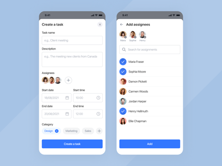
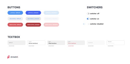
Color plays a crucial role in conveying information about the status of an app, its components, and various elements like buttons, links, menu items, and icons. A commonly adopted approach is to utilize a light gray color to indicate disabled items while employing an accent color to signify active or interactive elements.
Source: dribbble
Consistency & context
Maintaining consistency in color usage within an interface ensures that colors consistently convey the same meaning even when the context changes. For example, if red is utilized in branding, it is advisable to avoid using it to indicate error states. Instead, opt for an alternative color like yellow to prevent any potential confusion.
Source: dribbble
Color meaning
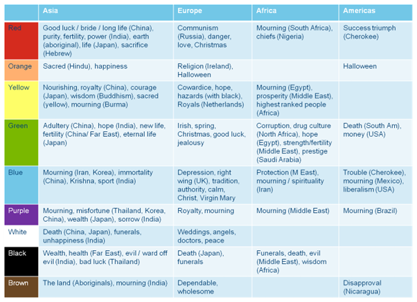
For centuries, scientists have delved into the physiological impact of specific colors. Colors not only contribute to aesthetics but also have the power to evoke emotions and associations. However, it’s important to note that the meaning of colors can vary based on cultural and situational contexts.
Source: seopressor
Color palettes
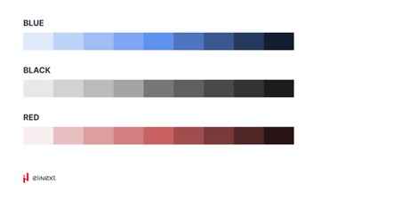
A comprehensive color scheme should include a primary color (or main colors), system colors such as dark and light gray, colors representing different states (error, warning, success), and various shades of these colors ranging from dark to light.
Source: dribbble
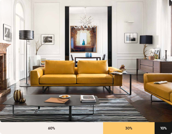
The 60–30–10 rule
This principle in UI design is derived from interior design. To achieve visual harmony in a room, it is recommended to utilize 60% as the dominant hue, 30% as the secondary color, and 10% as the accent color. This formula is effective as it establishes a sense of balance and facilitates smooth visual transitions between focal points. It is also remarkably straightforward to implement.
Source: prototypr
Source: dribbble
Conclusion
Typography, much like colors in the interface, holds significant meaning beyond what the average individual perceives. It contributes to text visibility, and readability, and sets the tone for the overall interface. Similarly, colors in the interface can direct attention, control user focus, and facilitate comparison between different objects.
Throughout this article series, we have shared a range of techniques our company employs to create high-quality products. UI/UX design goes well beyond creating visually appealing images. It delves into psychology, research, and understanding the preferences of the target audience, all while aligning with the overarching goals. You now possess a deeper comprehension of why designers are crucial in constructing websites that cater to specific user groups, manage attention effectively, consider regional and national audience characteristics, and optimize conversion rates. Design is more than mere aesthetics; it is the foundation that should be prioritized above all else.


