In today’s digital landscape, where competition for user attention is fierce, understanding user behavior is no longer just a good practice; it’s a necessity for success. Every click, scroll, and interaction tells a story, providing valuable insights into what users want, how they engage with products and services, and what motivates their decisions. User behavior research, therefore, becomes the compass that guides businesses towards creating user-centric experiences that resonate, convert, and drive growth.
This article delves into the crucial role user behavior research plays in shaping successful digital products and strategies. We’ll explore how understanding user behavior can lead to:
- Improved User Experience: Creating intuitive and engaging experiences that meet user needs.
- Enhanced Product Development: Designing products that are both user-friendly and meet business objectives.
- Effective Marketing Strategies: Targeting the right audience with the right message at the right time.
- Data-Driven Decision Making: Making informed decisions based on real user behavior data.
Why User Behavior Research Matters
Imagine creating a beautiful website or app, investing significant resources into design and functionality, only to find that users struggle to navigate it or fail to understand its purpose. This is a common scenario when user behavior is overlooked during the development process. User behavior research helps prevent such pitfalls and ensures that products and services are aligned with user needs and expectations.
Key Techniques for Understanding User Behavior
Several techniques can be employed to gather valuable insights into user behavior:
- User Interviews: Directly engaging with users to understand their motivations, needs, and pain points.
- Surveys: Collecting quantitative data through structured questionnaires to gauge user opinions and preferences.
- Usability Testing: Observing users interacting with a product or website to identify usability issues and areas for improvement.
- A/B Testing: Testing different versions of a web page or feature to determine which performs better.
- Analytics: Tracking website and app usage data to understand user behavior patterns and identify areas for optimization.
- Eye Tracking: Using technology to track eye movements to understand how users interact with visual content.
- Heatmaps: Visual representations of user interactions on a webpage, highlighting areas of interest and engagement.
Let’s delve deeper into some of these methods and see how our team applied them while conducting research on our internal product Leave manager.
What is Usability Testing?
Usability testing (also known as usability research) is the process of testing interfaces and interaction scenarios with real users. It’s important to note that participants in usability testing are not just any users; they are specifically chosen to represent the target audience of the product being tested. This means they should match demographic, geographic, socio-economic, and other relevant criteria.
A UX researcher asks a participant to complete a series of tasks (usually within a digital product prototype) while observing their behavior and actions. The conditions under which the testing takes place should closely mirror the conditions in which the product will be used in the future. For example, if we’re testing new software for ATMs, we should consider that people use ATMs in a wide variety of conditions: outdoors under a blazing sun, in heat, in cold, with gloves and bare hands, in low-light conditions, and so on. It’s necessary to recreate these conditions as accurately as possible during testing.
A moderator might ask the participant to voice their thoughts and comment on their actions, so UX researchers can understand what the person is feeling and thinking while using the prototype.
This is a powerful tool for evaluating the functionality of a website and ensuring effective navigation. Usability testing helps you learn more about users and get valuable feedback and insights from them, including:
- Does the design solve user problems?
- What usability flaws need to be fixed?
- What can be improved?
The ultimate goal is to fix and improve the prototype as much as possible before handing it off to developers.
Types of Usability Testing
Before choosing a user research method, you need to make a few decisions about the type of testing, based on available resources, target audience, and research goals (i.e., the questions you want to answer).
Three common types of usability testing include:
-
Moderated vs. Unmoderated:
* Moderated testing is conducted in person or remotely by a trained researcher who introduces the test to participants, answers their questions, and asks follow-up questions.
* Unmoderated testing is conducted without direct oversight; participants might be in a lab, but more likely they are at home and/or using their own devices to view the website being tested.
Moderated testing typically provides detailed results due to direct interaction between researchers and participants, but it can be costly to organize and conduct. Unmoderated testing is less expensive, but participants’ responses may be superficial, and follow-up questions are not possible.
Generally, moderated testing is used to explore the reasons behind user behavior, while unmoderated testing is used to verify a very specific question or observe and measure behavior patterns.
-
Remote vs. In-Person:
* Remote usability testing is conducted over the internet or phone.
* In-person testing, as the name implies, requires the test to be completed in the physical presence of the UX researcher/moderator.
Compared to remote testing, in-person testing offers additional data because researchers can observe and analyze body language and facial expressions. While in-person testing offers valuable insights, it typically involves greater cost and time commitment.
Remote testing doesn’t delve as deeply into participant reasoning, but it allows you to test a large number of people in different geographic locations using fewer resources.
-
Exploratory vs. Comparative:
* Exploratory testing is used when you want to get qualitative information about how users interact with your product. It’s an open-ended format that allows researchers to gather unlimited responses from users and ask questions freely.
* Comparative testing is used when you want to compare two or more versions of a product. This method allows you to understand which version performs best and enables you to make changes to the product design to make it more effective and easier to use.
Both types of testing are useful for understanding user experience, but exploratory testing allows for a deeper understanding, while comparative testing can be more precise for measuring performance.
Exploratory Testing:
Exploratory testing is open-ended. Participants are asked to brainstorm, share their opinions, and express emotional reactions to ideas and concepts. Information is typically gathered in the early stages of product development and helps researchers identify market gaps, discover potential new features, and implement new ideas.
Comparative Testing:
Comparative research methods involve asking users to choose between two solutions and are used to compare a website with its main competitors.
Each usability testing method provides answers to specific research questions. The choice of method will depend on both available resources and the set goals.
For example, remote and moderated research involves the use of telephone or video interviews.
Moderated and in-person research involves laboratory testing.
In-person and unmoderated testing takes place in controlled physical environments but does not require a person to conduct the test. This offers numerous advantages of testing in a controlled atmosphere and reduces the likelihood that the moderator may direct or influence participants with their questions.
The option we chose for testing Leave manager is remote unmoderated testing. It utilizes passive testing methods, primarily based on computer programs, that provide insights into how users interact with the website in their “natural environment.”
There is often confusion and debate regarding the relationship between UX testing and usability testing. These terms should not be used synonymously as they encompass different testing areas.
Usability testing focuses on the ease of use and performance of interfaces, navigation, micro-interactions, etc.
UX testing concerns itself with people’s enjoyment and satisfaction during the process of using a digital product.
Although we differentiate these concepts, UX researchers test usability and UX (user experience) simultaneously.
For example, one UX researcher might observe a participant completing a task (usability testing), while another investigates the user’s actions and behavior (UX testing).
These crucial metrics must always be considered during product testing. If a user can complete a task, the UX designer may feel they’ve done everything right. But what if the person felt irritation or frustration during the process? In this case, they’re more likely to choose a competitor’s product with better UX.
Usability testing tools
Let’s briefly review the main usability testing tools:
- Card sorting. Card sorting is a method used in the early stages of usability research to test element hierarchy and create website information architecture.
The moderator asks participants to sort cards into topics or categories—usually in order of importance or relevance.
- Paper prototypes. Paper prototyping is another method suitable for the early stages of research. With its help, UX teams evaluate user scenarios and information architecture.
Such prototypes are rarely tested with participants because any usability tests are quite expensive, and paper prototypes don’t allow users to provide meaningful feedback.
However, they help obtain basic information about users’ expectations regarding site navigation.
- Digital low-fidelity prototypes. Digital low-fidelity prototypes are a series of wireframes for testing user scenarios and simple navigation. As with paper prototypes, they provide limited feedback about the interaction experience.
- High-fidelity prototypes. Testing high-fidelity prototypes allows UX teams to receive accurate, meaningful feedback. Participants use a functional version of the final product to perform tasks.
- Click tracking. Through click tracking, UX designers gain insights into which elements of a prototype users click on. This helps determine which areas users interact with most frequently (or touch, in the case of a mobile device touchscreen).
Click tracking can be used to check link structure or how easily users can identify buttons and calls to action.
- Eye tracking. UX researchers use special eye-tracking devices to see how participants explore the interface and which elements capture their attention first. This information helps UX designers decide how to arrange elements on the screen and where to place the call to action.
Today, the market offers a vast array of user behavior analysis tools. These tools are software applications that track, analyze, and interpret data about user interactions on digital platforms such as websites, mobile apps, and other software systems. These tools encompass features like data tracking, heatmaps, session recording, funnel analysis, and segmentation capabilities. Together, they offer a comprehensive view of the user journey, enabling companies to understand patterns, identify pain points, and optimize the design and functionality of their digital assets.
One such tool is Hotjar. Hotjar is a popular tool for analyzing user behavior and gathering feedback on your website. While it’s not exclusively a usability testing tool, Hotjar offers a range of features for understanding user interaction, including heatmaps, recordings, and surveys. By tracking user movements and identifying areas of high engagement, Hotjar helps you understand what users are attracted to and where they struggle.
Another popular tool is Google Analytics. Google Analytics is a free web analytics service offered by Google that provides website owners with detailed insights into user behavior. It tracks and reports website traffic, user engagement, and conversions, helping businesses understand how visitors interact with their website, identify areas for improvement, and optimize their online presence for better performance and success.
Usability testing process
To ensure a successful usability test, it’s crucial to develop a plan and define goals. Without them, researchers won’t know what to test and how to evaluate the results. Generally, the usability testing process can be divided into 7 steps. Let’s delve into each of them in detail.
The first step is to define the goals of the usability study. They can be general or specific, for example:
- General: Which checkout method requires the least time?
- Specific: Will users be more likely to click on an animated button?
It’s important to prioritize and determine which functions need to be tested, such as the checkout process in an online store or the process of registering a new user on a website.
Of course, there’s a temptation to use a usability test to the maximum and get as much feedback as possible, but in this case, you can fatigue users, and the results will be inaccurate.
The second step is recruiting participants. We define and recruit representative users from our target audience or user base.
The third step is formulating tasks for users.
Everything we say and show participants during testing, including our questions and wording, affects their responses.
Tasks can be open-ended or closed-ended, and the test should include the right combination of both:
- Closed-ended: They don’t give users room for interpretation: a person is asked a specific question, and the criteria for success and failure are clearly defined (e.g., “Find a venue for an event that can accommodate up to 12 people”). Closed-ended tasks allow for obtaining quantitative and precise results.
- Open-ended: In this case, participants, on the contrary, can perform the task in various ways. They should experiment: “Your friends are talking about a new workout app, but you’ve never used it. Learn how this app works.” Open-ended tasks allow for obtaining qualitative, sometimes unexpected results.
The fourth step is conducting the test.
It’s crucial to make sure participants feel comfortable – so at this stage, we remind them that we’re testing the product, not their abilities. A pre-prepared script helps provide consistent instructions, use a unified tone, and wording.
We don’t interfere with the test – this allows us to obtain reliable results and discover new information about user behavior. Unexpected interactions with the product are typically the source of the most significant insights. We observe the participants’ behavior and analyze which features or characteristics need improvement.
Sessions are recorded – as there may be a need to revisit the study later.
The fifth step is data collection. We collect qualitative and quantitative data during the test. This can be achieved through methods such as observation, note-taking, screen recording, task completion time, and surveys/questionnaires.
The sixth step involves analysis of results to identify patterns, recurring issues, and areas of satisfaction or frustration.
And the final seventh step is preparing the report.
The report is an effective way to summarize the usability testing to share results with stakeholders.
Specific wording is essential in the report – “Users can’t buy the right product” is not a very helpful formulation because it’s unclear why. But: “Users can’t buy the right product because they can’t find the search button” – that’s a different story.
Next, we categorize and prioritize identified usability issues. We also include recommendations in the report on how to address usability problems.
If usability testing has revealed issues, they should be addressed, and the study should be conducted again. In this case, the first three steps can be skipped, and you can start directly with the tests.
Using behavioral analytics tools in internal company projects
For our Leave manager, we conducted unmoderated remote testing. Our process followed these steps:
- Defining the research objective and forming hypotheses we aimed to confirm or refute.
- Identifying the most interesting user types for our research.
- Conducting the tests.
- Collecting and analyzing the results.
- Compiling a report summarizing our findings.
Our system has 7 distinct roles, many of which are very similar with overlapping functions. Therefore, we focused on the 3 roles most frequently used:
- The regular employee: This role has the ability to submit leave/sick leave requests, view their calculations, access their profile, and see requests from colleagues.
- The project manager: In addition to regular employee functions, this role can submit requests for colleagues, process requests from team members, export requests, generate reports on team member’s work time, and manage teams.
- The resource manager: This role is responsible for an entire department, encompassing multiple employees who may belong to different teams. They have all the permissions available to regular employees and project managers, and additionally, they can manage the location of subordinates.
To study user interaction with the system, we utilized session recordings and heatmaps provided by Hotjar. We reviewed around 500 screen recordings and identified key user interaction scenarios with the application.
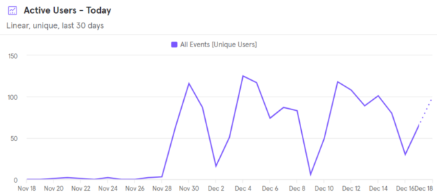
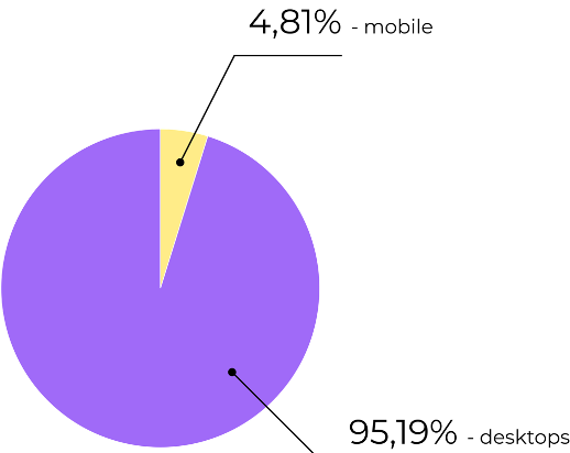
The reports clearly show that the system is actively used on weekdays and practically not used on weekends. On average, about 40 people use the system daily, with an average interaction time of 7 minutes. 95.19% of our users access the system from desktop devices.
The graph shows a noticeable dip in usage on weekends.
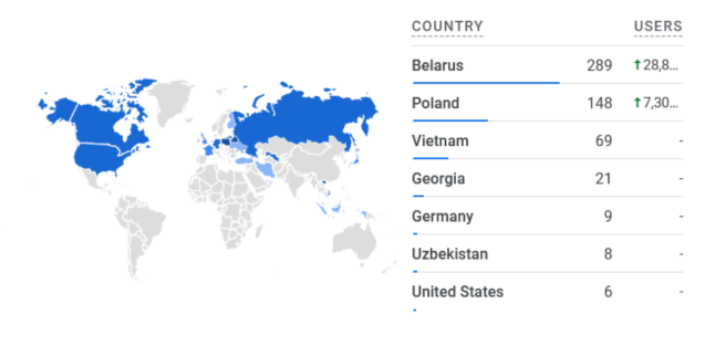
The geographic locations of our users are quite diverse, but four locations dominate: Belarus, Poland, Vietnam, and Georgia.
95.19% of users utilize desktop devices, while 4.81% use mobile devices.
This is explained by the minimal mobile adaptation implemented during development. However, reviewing the recordings revealed that this is insufficient, and there’s a need to optimize the application for mobile devices, at least for the parts used by regular employees. This is particularly important for sick leave requests, as someone waking up with a fever is unlikely to use a desktop to submit a request; they’ll opt for what’s readily available – a smartphone or tablet.
Analyzing recordings through Hotjar, we identified key usage scenarios for users with different roles:
- Regular employees spend the least time in the system, rarely use filters or sorting in tables, and almost never adjust column width or table display settings. They primarily interact with two application pages: “requests” and “my requests.” Occasionally, they visit their profiles and check calculations. Most often, employees log in, submit a leave or sick leave request, and immediately log out, a process taking no more than two minutes. Occasionally, they check colleagues’ requests, but this isn’t the most common scenario.
- Project managers and resource managers, naturally, spend more time in the system, and their interaction scenario differs slightly. They check notifications, process requests, submit requests on their behalf or on behalf of others. They often utilize filters and sorting in tables but almost never use column settings or table display parameters.
During a month of observation, we didn’t detect any interaction with the “teams” and “reports” pages, suggesting this functionality isn’t popular and isn’t regularly required.
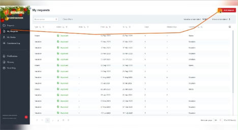
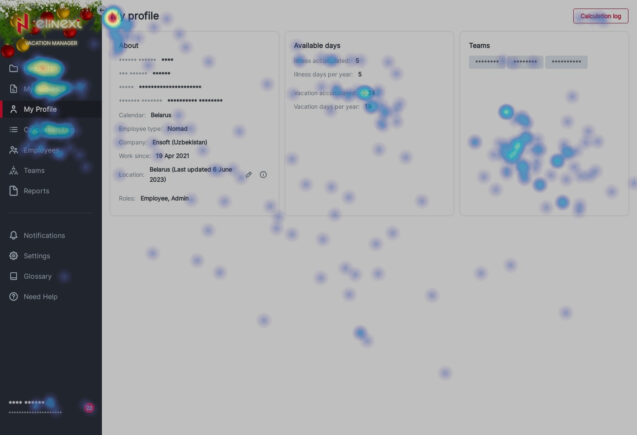
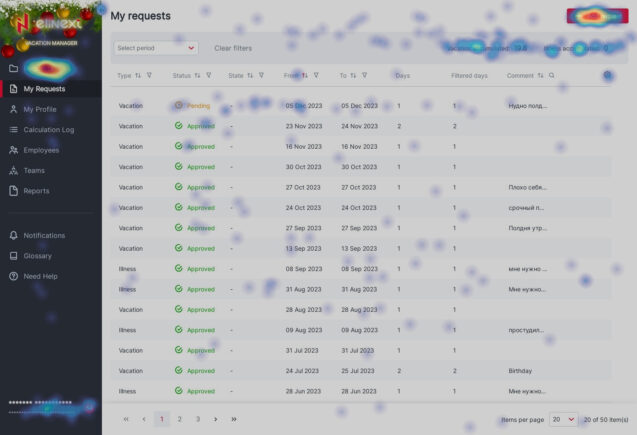
The following pictures showcase heatmaps provided by Hotjar. For example, this map for project manager and resource manager roles shows the most frequently used items in the side menu.
This map highlights that managers most often navigate from their own requests page to the all requests page or use the add request button.
The testing conducted by our team confirmed the hypotheses formulated during the development phase. The research did not reveal any significant user interaction issues. We did not encounter any noteworthy difficulties in using the system, and those that were identified were so infrequent and minor that they could be attributed to statistical error.
We are confident that all our assumptions are correct; all the user roles we defined use the system precisely as we anticipated. Users do not need to spend significant time learning the application to find the necessary functions; they easily and efficiently complete their tasks, spending minimal time in the system. All the functionalities we proposed are used adequately and facilitate user workflow. The only aspect requiring improvement and refinement is mobile device adaptation. However, this issue can be easily addressed.
Conclusion
User behavior research is an invaluable asset for any business seeking to create successful digital products and strategies. By investing in understanding how users interact with their offerings, businesses can unlock a wealth of opportunities to optimize their products, services, and marketing efforts, ultimately driving greater engagement, satisfaction, and profitability.
By embracing user behavior research as an integral part of their decision-making processes, businesses can ensure that they are building products and experiences that truly resonate with their target audience.


