In our ongoing cycle of articles, we delve into how users interact with the interface. The first article of the current cycle can be found at the following link.
In the today’s article, we explore several topics, including:
– The rationale behind the varying arrangements of elements such as images, headings, and paragraphs in different products.
– The importance of element size on a page and what determines size of buttons, checkboxes, switchers, and other interactive controls.
– The necessity of breaking down information into smaller portions and limitations of a user’s ability to remember characters.
Reading patterns
The way users read and consume information is closely tied to their overall user experience, which is a core focus of UX/UI design services, and depends on the purpose of the interface. Users tend to scan rather than read the entire text, focusing on keywords that align with their specific interests or needs.
We will begin by exploring how users interact with a product, what elements they prioritize, and reasons why a well-written article may go unread.
How individuals read online is greatly influenced by the following factors:
- The task at hand
- Their prior experiences with the internet, the specific website or brand
- The layout of the page
- The type of content on the page (e.g. text or images).
Now let’s talk about patterns that will help us to better understand the user’s psychology while they scan content.
1. F-pattern
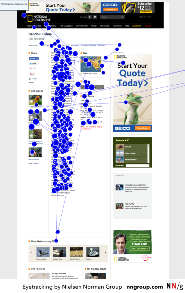
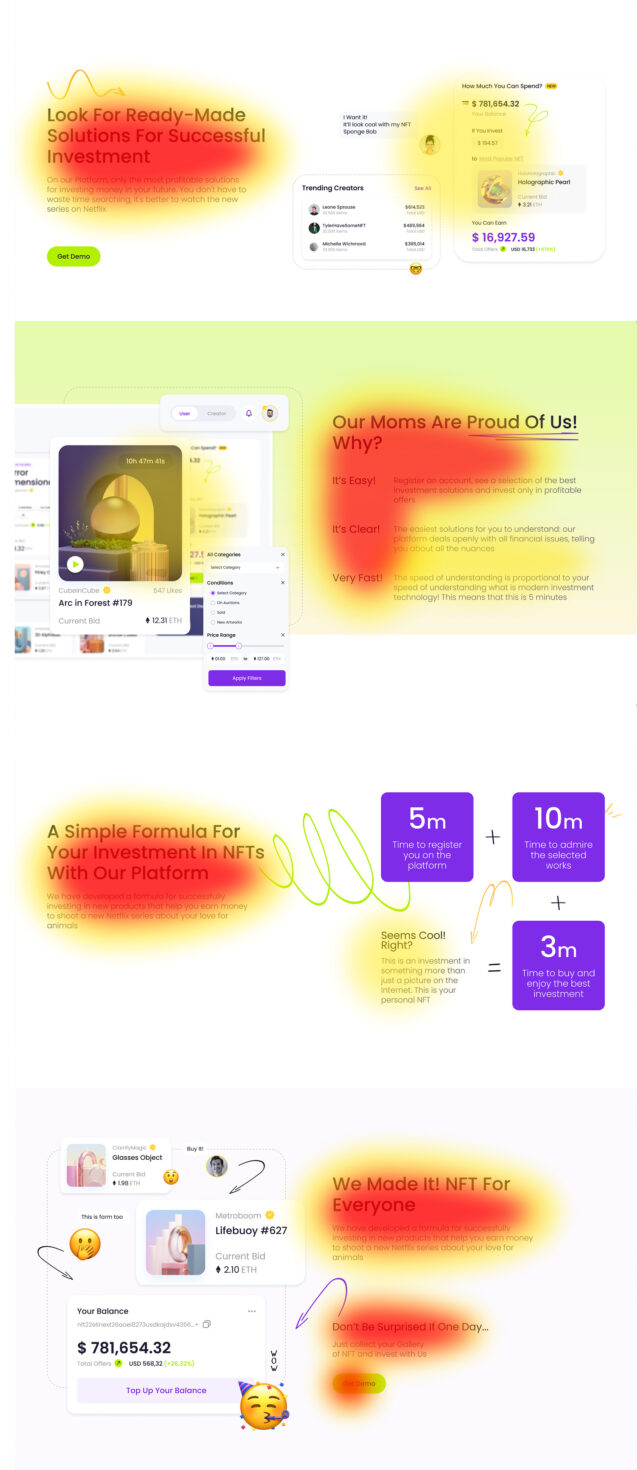
Designers have referred to the eye-tracking pattern resulting from this scanning behavior as the ‘F-pattern’ due to its resemblance to the capital letter F. In languages that are read from left to right, readers tend to focus more on the text located on the left side and towards the top of the page, rather than the text on the right or towards the bottom of the page.
Source: nngroup
2. Spotted pattern
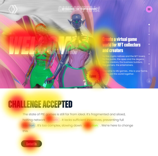
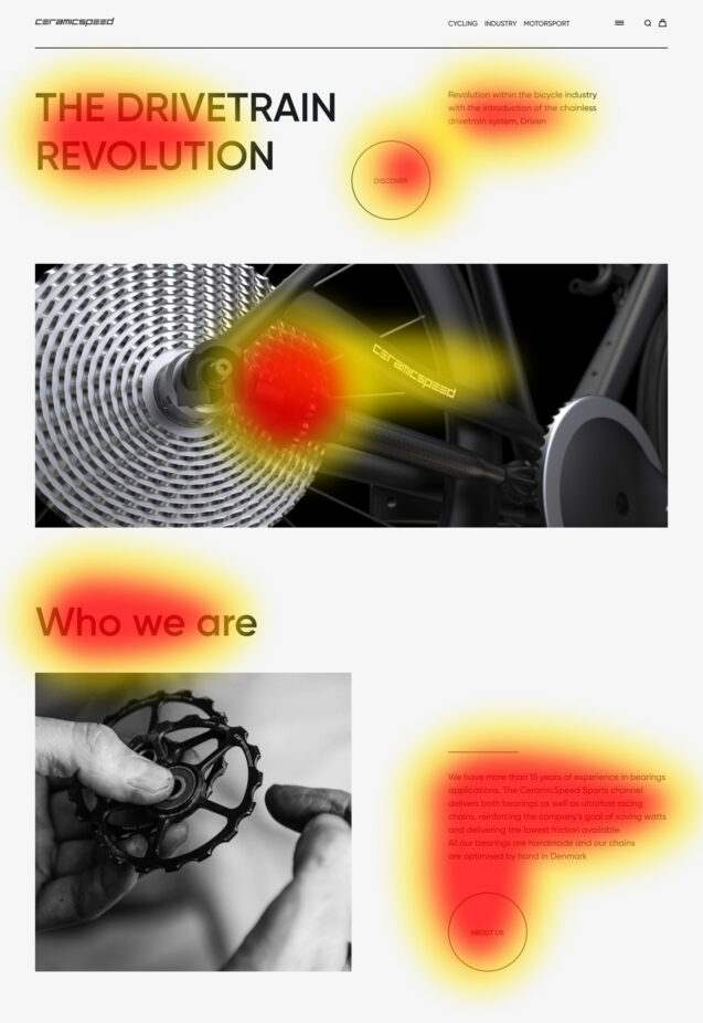
The spotted scanning pattern involves focusing on particular words or groups of words dispersed on the page. Users select these words for one of two reasons: They visually stand out due to their distinct styling (e.g., links, differently colored words, bolded words, bulleted lists).
If designers effectively name links, differentiate important words from the rest of the body text, and create bulleted lists, the spotted scanning pattern becomes slightly more functional compared to the F-pattern.
Source: dribbble
3. Layer-cake pattern
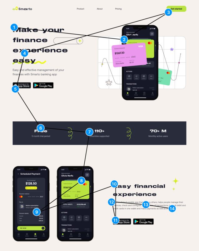
The layer-cake scanning pattern involves primarily fixations on the headings and subheadings of the page. There are minimal fixations on the text in between until users find the heading they are interested in. At that point, they typically proceed to read the accompanying body text beneath it.
Source: dribbble
4. Commitment pattern
The commitment pattern represents conventional reading rather than scanning. In this pattern, users pay close attention to all or most of the content words in the text passage. It typically occurs when users have a high level of interest or motivation to read the content, such as when studying for a test or following instructions on a specific website to return an item.
Source: nngroup
5. Zigzag pattern
The zigzag layout has emerged as an alternative to the aligned pattern, gaining popularity due to its increasing use. In this layout, the placement of images and text on each horizontal row alternates. This recent surge in popularity can be attributed to its ability to break the monotony and introduce visual interest to a lengthy page.
Source: dribbble
6. Aligned pattern
The aligned layout, which is the traditional pattern, displays rows stacked one below the other. Images are placed on one side of the layout, while text is positioned on the opposite side. In an eye-tracking study, users encountered difficulties when scanning pages that included decorative images in an alternating list layout. However, users were able to scan efficiently on pages where text and imagery were vertically aligned.
Source: dribbble
Fundamental laws of design
This section explores two fundamental laws that are rooted in human perception of the physical world. These laws enable users to interact with content using active elements and help them consistently remember the information they receive by breaking it down into meaningful blocks.
1. Fitts’ law
In 1954, psychologist Paul Fitts conducted research on the human motor system, revealing that the time taken to reach a target depends on its distance and size, with an inverse relationship between the two. According to Fitts’ law, faster movements and smaller targets lead to higher error rates, as there is a trade-off between speed and accuracy. While there are various versions of Fitts’ law, they all encompass the core idea.
Essentially, Fitts’ law states that the time required for an individual to navigate a pointer, such as a mouse cursor, to a target area is determined by the distance to the target divided by the size of it. Consequently, the longer the distance and the smaller the size of the target, the longer it takes to reach it.
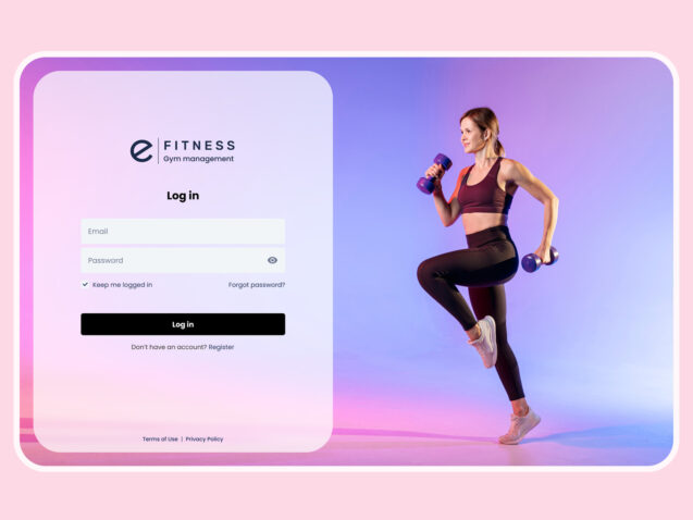
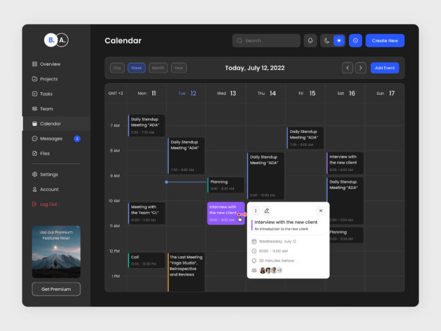
The main button should be placed closer to the fields and have a bigger size than the secondary button. Dropdowns should display only a limited number of items at once. Active items should be positioned closer to the center of the screen as the user starts their cursor from that point. Headers, on the other hand, can be placed in the corners.
Source: dribble
Source: dribble
Source: dribbble
Here, we optimized the user flow by creating the most direct path to the actions we anticipate the user will take.
2. Millers’ law
In 1956, George Miller proposed that the capacity of immediate memory and absolute judgment is limited to around 7 pieces of information. This main unit of information, known as the bit, is the amount of data needed to choose between two equally likely options. For example, 4 bits of information allow for a decision between 16 binary alternatives through 4 successive binary choices. The channel capacity, which represents the point at which confusion leads to incorrect judgments, is measured by the number of bits that can be reliably transmitted through a channel within a specific timeframe.
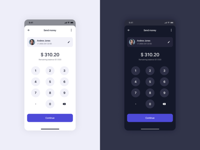
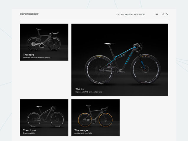
Due to these limitations, the average person can only retain around 7 items (plus or minus 2) in their memory. This is why phone numbers typically consist of 6 to 8 characters. Additionally, people tend to prefer grouping characters, as it aids in better recall compared to trying to remember the entire number as a whole. Similarly, minimalistic designs in online stores often display 6 or 8 products on the screen, keeping in mind the capacity limitations of human memory.
Source: dribbble
Source: dribbble
These principles have been derived from extensive research in human psychology and have proven to be successful over time. As a result, every design decision can be supported by evidence and rationale. By incorporating these tips, designers can create user-friendly layouts that facilitate the seamless and efficient consumption of information.
Conclusion
In conclusion, the reading patterns on a webpage can vary depending on the type of site. Currently, the F- and Z-patterns are popular, with the F-pattern being effective for sites with large blocks of text. When it comes to reading text on websites, users tend to prefer a minimalistic style that follows the ZigZag pattern over other patterns. However, it is important to note that patterns can evolve, but users may not necessarily be aware of or understand each pattern. Nonetheless, users can easily adapt to any given pattern. Furthermore, utilizing sufficient element sizes can significantly influence user decision-making by eliminating the need to spend time searching for information. Additionally, structuring information on a website in smaller portions helps ensure that users receive information in the proper sequence.

