In the world of web development, each element of your digital product, whether it’s a website or a mobile application, plays a crucial role in shaping the user experience. This article delves into potential challenges users might face at different points in their interaction with a web product. We also provide solutions, all guided by the principles of UX/UI design.
Why UX and UI design is the keystone in building modern web solutions? UX (User Experience) is not merely about usability; it’s about creating an emotional connection between the user and the product. In simpler terms, the UI (User Interface) is like the outer appearance that facilitates the interaction between the user and the design, providing both its visual elements and functional features.
At Elinext, we deeply understand that every detail in design can define success or failure in the virtual space. In this article, we share our experience while delving into why these concepts are critically important, how they interact, and how their proper application can be the key to a successful online presence.
Intuitively understandable user interface: a key success factor
Let’s outline a few aspects that we at Elinext employ when crafting our products:
User-Centric Design: on the path to an intuitive user interface, understanding user needs plays a pivotal role. Considering this, our goal is to design an interface that minimizes obstacles in user interaction, aligning closely with the genuine needs of users.
Principles of Intuitive Design: a clear understanding of the principles of intuitive design is a crucial aspect of creating effective interfaces. We’ll explore how familiar elements and scenarios help users easily adapt to new products and services.
User Journey: each user interaction with an interface is a unique journey that shapes their overall experience. In this article, we’ll demonstrate how we create intuitive interaction paths that enhance overall user satisfaction.
Effective Navigation Elements: intuitiveness is also linked to the proper selection and placement of navigation elements. We’ll discuss how to effectively make the user’s path through an application or website clear and natural.
Testing Intuitiveness: сonducting tests for intuitiveness is highly important, identifying weak points and optimizing the interface for maximum user satisfaction.
Improving user experience: solving common issues on the Login page
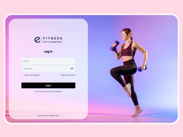
The login page is among the most crucial and frequently visited sections of a digital product. It’s where users embark on their journey, and their initial impressions can significantly impact their ongoing interaction with the resource. Nevertheless, numerous websites and mobile applications confront shared challenges that may discourage users. In this article, we’ll explore some of these problems and propose solutions to enhance user experience, using the example of the login page for a gym management system.
Source: https://dribbble.com/shots/22368939-Login-Sign-In-E-Fitness-Gym-Management-System
- Problem: forgotten password — a path to nowhere
One frequent situation on the login page involves users forgetting their passwords. In cases where there’s no option for password recovery or the recovery process lacks intuitiveness, users might lose interest.
Solution: Place a password recovery link below the password input field, aiding users in quickly finding it (Principle 4: Consistency and standards). Provide a simple and intuitive password recovery method, such as via email or SMS. Avoid overloading users with unnecessary steps and requests.
- Problem: lack of “Remember Me” option
Some sites don’t provide a “Remember Me” option, which can be inconvenient for users who want to stay logged in without re-entering their credentials.
Solution: Add a “Remember Me” option on the login page so users can stay logged in even after closing their browser. This enhances the convenience for users who frequently use the platform.
- Problem: redundant fields — a maze for users
When the login page requests more information than necessary for basic authentication, it creates confusion.
Solution: Limit the fields on the login page to only those genuinely necessary for login. Additional data can be collected later in the interaction (Principle 5: Error prevention).
- Problem: absence of “Sign Up” button — losing potential users
If the login page doesn’t offer a clear path to create a new account, users might be lost.
Solution: Add a clear and noticeable “Sign Up” button for an expedited registration process (Principle 6: Recognition rather than recall).
- Problem: lack of “Show/Hide Password” option — convenience compromised
Users may face difficulties entering passwords if they don’t have the option to “Show/Hide Password.”
Solution: Add a toggle switch for users to control password visibility during input. Use an eye icon to make the interface intuitively understandable for users (Principle 2: Ensure the system matches the real world).
Beyond just an image: solving key UI and UX issues on the product card page
In the world of online shopping, each product card is more than just an image with a price tag. It’s an entire realm of possibilities and expectations that users anticipate seeing and experiencing. In this chapter, we will delve into the perspective of your audience. We will explore how to create a product card that not only captures attention with its visual appeal but also addresses key issues in interface and user experience.
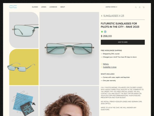
From displaying information to interacting with elements, we will delve into crafting a unique space where every detail matters. Let’s explore together how to ensure clarity, convenience, and attractiveness on the product card page, using the example of a product card for an e-commerce store specializing in optics.
Source: https://dribbble.com/shots/20998269-Fashion-Glasses-Store-eCommerce-Website
- Problem: unclear information structure
Product information is presented haphazardly, hindering quick comprehension.
Solution: Organize the information into logical blocks such as “Delivery Information”, “Specifications” and “Product Description”, as shown in the example, or add other sections at your discretion, following the principle of “Clarity and Minimalism” heuristic (Principle 1).
- Problem: essential information not prominently displayed
Key details, like price or availability, are not immediately visible.
Solution: Place crucial details near the top of the page, adhering to the “Help Users Recognize, Diagnose, and Recover from Errors” heuristic (Principle 5).
- Problem: unclear action buttons
Buttons like “Add to Cart” might confuse.
Solution: Formulate clear and action-oriented button labels, aligning with user expectations, in line with the “Visibility of System Status” heuristic (Principle 1).
- Problem: non-informative images
The product images presented on the product card page fall short, not conveying its key features. This can significantly diminish user interest and complicate the decision-making process for a purchase. In our example, particular emphasis is placed on product photography.
Solution: Extensive image set: provide users with an extensive array of product images, allowing them to examine it from various angles. Include detailed photos showcasing the product’s appearance from different perspectives. Images highlighting key features: insert images that showcase the product’s key characteristics. This may involve photographs of crucial details, functions, or textures that users might want to examine more closely.
Consideration of aesthetic aspect: when adding images, take into account the aesthetic aspect. Photos should be of high quality, clearly displaying product details. Consider the arrangement, lighting, and overall visual attractiveness.
- Problem: lack of support on the product card page
Users find it challenging to easily obtain answers to their questions about the product.
Solution: Implement live chat support, add a Frequently Asked Questions (FAQ) section, or provide contact information for inquiries, adhering to the principle of “Help users recognize, diagnose, and recover from errors” (Principle 5).
- Problem: unclear delivery and return conditions
Information regarding the delivery and return of the product may be unclear or hard to access.
Solution: Provide detailed and clear delivery and return conditions, adhering to the principle of ‘Help’ users recognize, diagnose, and recover from errors” (Principle 5).
- Problem: insufficient options and customization features
Users cannot customize their order according to their preferences, such as color, size, and other parameters.
Solution: Integrate the option to choose the color, size, and other parameters of the product (Principle 10: Help and documentation).
Checkout without headaches: transforming UI/UX into a tool for seamless purchases
In the world of online shopping, the checkout process becomes a pivotal moment, determining whether the purchase will be a pleasant and seamless experience or a headache-inducing ordeal. The checkout page is a crossroads where users make decisions and complete their journey from selecting a product to finalizing the purchase.
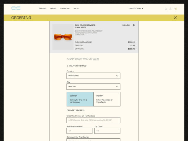
In this chapter, we delve into the realm of UI/UX on the checkout page, exploring the key issues users face and providing innovative solutions to overcome them. From adding items to the cart to completing the payment, let’s examine how to make this process highly intuitive, efficient, and enjoyable. We’ll turn UI/UX into a reliable tool for hassle-free purchases, using the checkout page of an e-commerce store specializing in optics as our example from the previous chapter.
Source: https://dribbble.com/shots/20998269-Fashion-Glasses-Store-eCommerce-Website
- Problem: unclear navigation and checkout steps
Users often encounter confusion during the checkout process due to an unclear page structure and the absence of explicit indications of steps.
Solution: Implement visual step indicators with clear labels to ensure users precisely know which stage they are at (Principle 6: Recognition rather than recall). It also provides concise and clear instructions for each step to enhance user confidence (Principle 4: Consistency and standards).
- Problem: inconvenient data input methods
Completing forms and entering data can be slow and confusing for users.
Solution: Implement autofill functionality and contextual prompts to simplify the data input process (Principle 3: User control and freedom). Make only essential fields mandatory to reduce barriers for users (Principle 5: Error prevention).
- Problem: lack of editing options
Users find it challenging to easily edit selected items or order parameters.
Solution: Allow users to edit their order directly on the checkout page (Principle 3: User control and freedom). “Back” and “Cancel” Buttons: Provide simple ways to cancel actions or return to previous steps (Principle 7: Flexibility and efficiency of use).
- Problem: unclear information blocks
Information about products, prices, and delivery is unclear and causes confusion.
Solution: Clarity of prices: display prices, promotions, and total costs (Principle 1: Visibility of system status). And also detailed descriptions: provide detailed descriptions of products and services, including features and specifications (Principle 2: Match between system and the real world).
- Problem: hidden additional costs
Users encounter an unpleasant surprise in the form of hidden costs that appear closer to the completion of the checkout process.
Solution: transparency about costs: highlight all additional costs in advance, providing clear information about the price (Principle 8: Aesthetic and minimalist design).
Conclusion
In conclusion, it is crucial to aspire to achieve the perfect user interface (UI) and user experience (UX) on every page of your website. Remember that every detail in design matters and influences the user’s perception, from the first glance to the final interaction. Applying UX/UI design principles is not only the key to a successful online presence but also a way to create an emotional connection with your visitors.
Real-world examples help illustrate the principles and approaches presented in the article. We hope that these samples inspire you to create interfaces and experiences that are not only functional but also enjoyable for your users.
Don’t forget that improving UI and UX is a continuous process that requires attention to user feedback and changes in their needs. Strive for perfection, page by page, and your website will become an appealing and user-friendly place for everyone who visits it.


