Welcome to the third article in our Design Principles series. In previous articles, we examined UX and Nielsen’s heuristics, reading patterns, and Fitts’s and Miller’s laws. If you haven’t read those yet, here is one of the links to the previous article.
Here we will dive into the basic principles of composition that are based on Gestalt psychology.
These principles include:
- proximity
- similarity
- symmetry and balance
- contrast
- focal point and others.
By understanding these principles and how they relate to Gestalt psychology, designers can create visually appealing and user-friendly interfaces.
Additionally, composition refers to the arrangement and organization of visual elements within a design. It plays a crucial role in guiding user attention, creating a visual hierarchy, and conveying the intended message.
User Interface (UI)
When it comes to the UI (User Interface), it involves envisioning visual aspects such as:
- color palette
- text sizing
- behavior of active items like fields, buttons, checkboxes, etc.
Furthermore, it is important to establish principles that enable users to combine items to accomplish a specific task or complete an item.
Gestalt principles
The Gestalt Principles are a set of laws that explain how human perception works when it comes to organizing content and recognizing patterns. Designers utilize these principles to arrange elements on websites and other interfaces in a way that is visually appealing and easy to understand.
The term “Gestalt” originates from German and means “unified whole”. The initial development of the Gestalt Principles took place in the 1920s by psychologists Max Wertheimer, Kurt Koffka, and Wolfgang Kohler. They aimed to comprehend how humans make sense of the chaotic stimuli in their surroundings. The researchers identified a set of laws that explain how the mind naturally seeks order within disorder, allowing it to perceive a collection of individual elements as a cohesive whole.
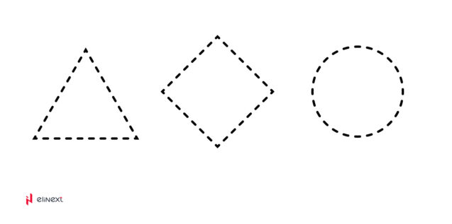
1. Law 1: Closure
Users naturally have a preference for complete shapes, leading them to automatically fill in gaps between elements to perceive a unified image or object. This innate behavior allows us to perceive the whole as a coherent entity.
Source: Elinext
Source: Elinext
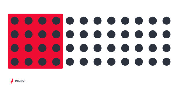
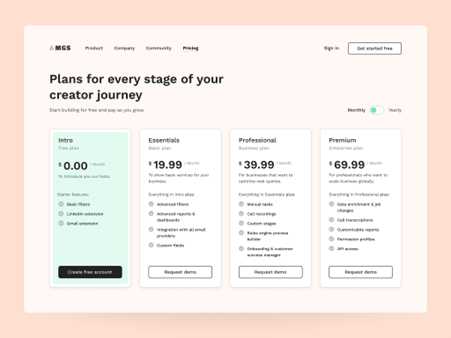
2. Law 2: Common region
Users have a tendency to group elements that are within the same closed region. By placing related objects within a shared closed area, we can visually indicate that they are connected or hold a common purpose.
Source: Elinext
Source: dribbble
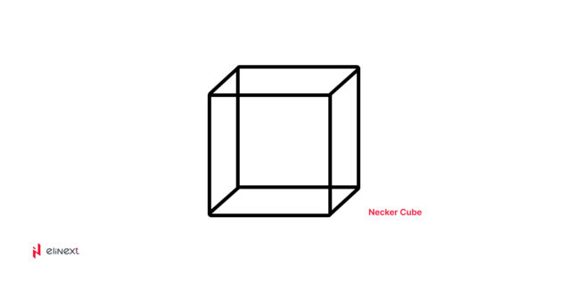
3. Law 3: Multi-stability
Users have a natural aversion to uncertainty and tend to gravitate towards solid and stable items. In non-ambiguous images, the user’s attention is typically drawn to the foreground of the image first, allowing for a clearer perception of the overall composition.
Source: Elinext
Source: dribbble
4. Law 4: Proximity
Users tend to prefer grouping elements that are closer together while keeping them visually separate from those that are farther apart.
Source: Elinext
Source: dribbble
Law 5: Similarity
The user’s eye naturally establishes a connection between similar elements in a design. Achieving similarity can be accomplished by utilizing basic elements such as shapes, colors, and sizes. This principle can be applied to buttons, links, headers, and icons, ensuring that they resemble objects that users are already familiar with.
Source: Elinext
Source: dribbble
Law 6: Continuation
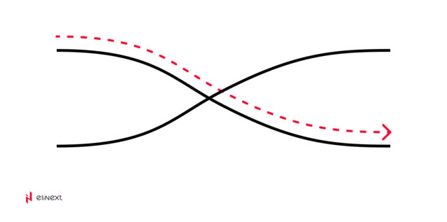
The user’s eye naturally tracks the paths, lines, and curves within a design, favoring a seamless flow of visual elements instead of isolated objects. This principle is commonly employed when designing sliders, accordions, and swipe gestures to ensure a smooth and intuitive user experience.
Source: Elinext
Source: dribbble
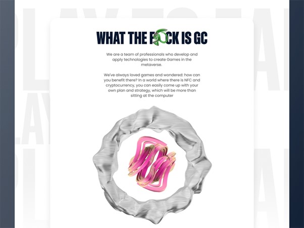
Law 7: Figure/Ground
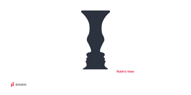
As humans, we have a natural aversion to uncertainty and seek out solid, stable items. In most cases, our visual perception tends to focus on the foreground of an image before delving into its details. This is similar to how we interpret Rubin’s Vase illusion.
The principle of figure/ground can be applied in various ways, particularly in UX/UI design services, where it is used to create contrast between elements. For instance, using light text (figure) against a dark background (ground) helps to enhance legibility and draw attention to the content.
Source: Elinext
Source: dribbble
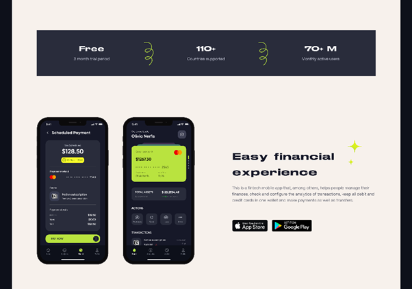
Law 8: Symmetry and order
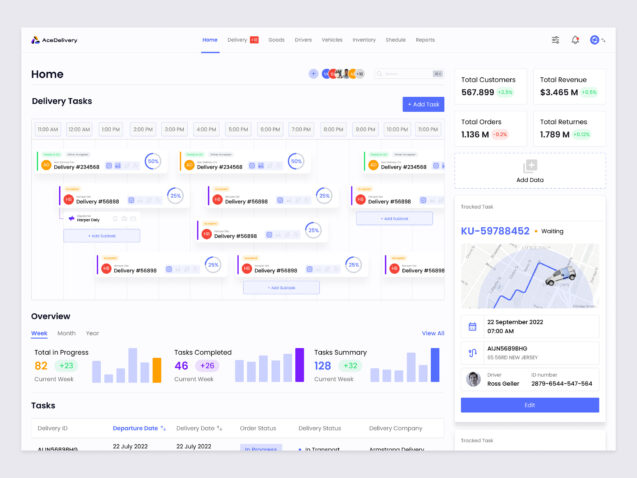
A well-designed interface should strive for balance and completeness to facilitate the user’s understanding and minimize the effort required to perceive the overall picture. This principle is particularly useful when creating products that include a left menu (such as a sidebar or menu) and a right menu (such as settings or notifications), ensuring that both elements are visually cohesive and harmoniously integrated into the interface.
Source: Elinext
Source: dribbble
Composition
Once we have examined how the user’s mindset absorbs information, it is important to delve into the topic of composition and understand why Gestalt principles play a crucial role in this context.
Composition involves bringing together all the individual elements to create a unified whole. It encompasses the arrangement of blank spaces, images, graphics, and colors, all synergistically working together to form a coherent and visually appealing composition. Achieving a successful composition entails organizing, presenting, coordinating, and assembling these elements in a way that not only looks good but also serves a functional and effective purpose. Here are some tips that can assist in creating a balanced composition.
Tip1: Focusing
When users are presented with an abundance of options in a single place, they may experience decision paralysis and struggle to make a choice. To alleviate this issue, it is essential to provide the user with a limited number of options, ideally one or two, to facilitate decision-making.
Design plays a crucial role in telling a specific story, and it is important to identify and prioritize the focal point that conveys this narrative in the most impactful and effective manner. By carefully selecting the focal point, the design can effectively communicate the intended message and engage the user in a compelling way.
Source: dribbble
Tip 2: Leadline
By incorporating lead lines and shapes into graphics, we are able to guide viewers toward specific points of interest within the composition. This technique enables us to have some influence over where the viewer’s attention is directed when they encounter the design. It allows us to establish a visual hierarchy and control the flow of the viewer’s gaze, ensuring that important elements are noticed and engaged with.
Source: dribbble
Tip 3:Hierarchy
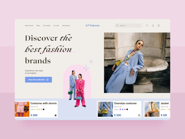
Hierarchy refers to the organization and design of elements in a way that visually communicates their relative importance. This can be achieved by making more important elements larger and bolder, while less important elements may be smaller and more subdued. By employing hierarchy in design, we can guide the viewer’s attention and emphasize key elements, creating a clear visual structure and facilitating effective communication.
Source: dribbble
Tip 4:Alignment
It’s important to note that in design, visual alignment holds more significance than precise mathematical measurements. While precise instruments may not be used to measure alignment, it is crucial to ensure that design elements appear visually aligned and organized to create a pleasing and balanced composition.
One type of balance in design is symmetrical balance, which involves creating a sense of equilibrium by reflecting design elements from left to right or from top to bottom. This approach creates a visually harmonious composition.
Symmetrical balance
Source: dribbble
Another type of balance commonly used is asymmetrical balance, which achieves harmony without relying on symmetry. It involves the careful arrangement of elements to create a sense of balance and visual stability.
Asymmetrical
Source: dribbble
Tip 5:Harmony
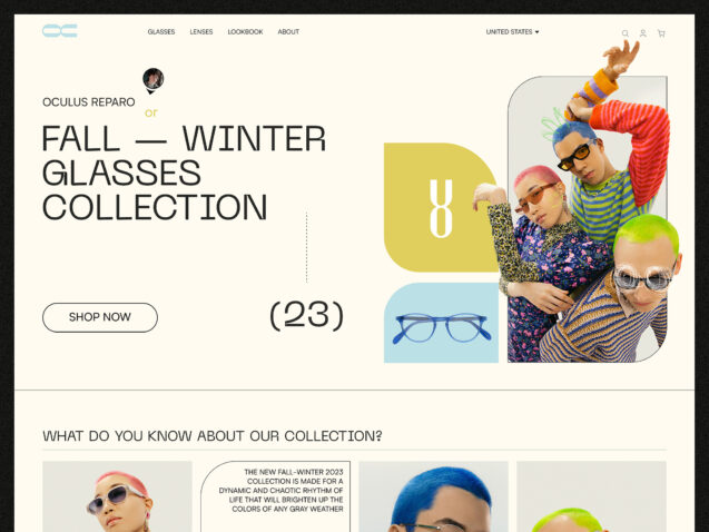
A common mistake in compositions is the use of images that do not complement each other. When the user encounters multiple images within a composition, it is important to ensure that they all harmonize with one another and with the accompanying text in the design. This ensures a cohesive and unified visual experience for the user.
Source: dribbble
Tip 6:Contrast
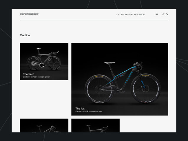
Using contrast in design is highly advantageous as it allows for the highlighting or obscuring of specific elements. Increasing contrast or incorporating high-contrast colors can effectively make an element stand out and attract attention. Conversely, reducing contrast can cause an element to blend into the background and become less noticeable. By strategically utilizing contrast, designers can control the visual emphasis and create a balanced composition.
Source: dribbble
Tip 7:Repeating
Repeating graphic elements, layout grids, and font sizes in design serves multiple purposes. Firstly, it reassures the user that they are consistently using the same product or interface, promoting a sense of familiarity and continuity. Additionally, this repetition helps to establish a coherent set of pages or screens within the overall design. By maintaining consistency in graphic elements, layout structure, and font sizes, designers can create a cohesive visual experience for users, enhancing usability and reinforcing brand identity.
Source: dribbble
Tip 8:White space
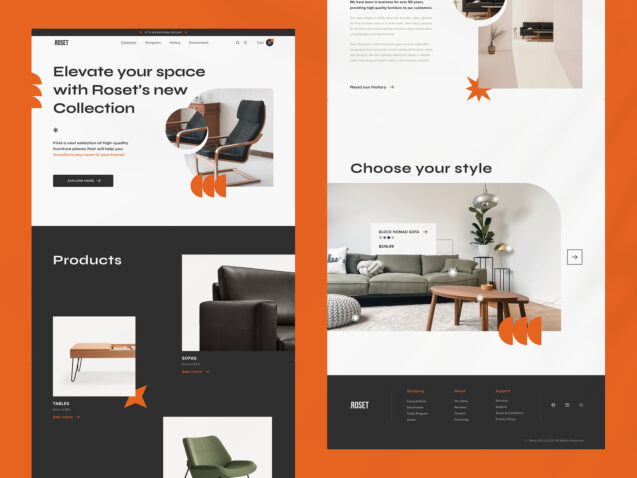
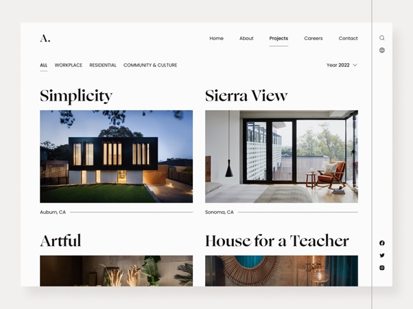
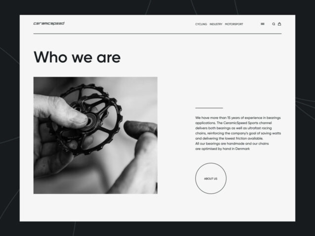
Creative use of white space can greatly enhance the elegance and overall appearance of a design. By juxtaposing it with more complex and visually dense elements, white space provides a sense of balance and breathing room. It is important to note that white space should not be mistaken for “empty space.” Instead, it is a deliberate design choice that adds sophistication to the composition and helps to create a harmonious visual experience. When employed thoughtfully, white space can elevate the aesthetic impact of a design and contribute to its overall effectiveness.
Source: dribbble
Conclusion
Gestalt psychology has been a valuable tool for designers for over a century. It aids in constructing compositions effectively and enables users to connect similar elements. These principles remain relevant today and integrating them into design allows for visually pleasing and user-friendly outcomes. By comprehending how humans perceive and interpret visual elements, designers can utilize these principles to craft cohesive and captivating user experiences.
