Cross-platform design (also called platform-agnostic design) is a strategic approach to user experience that aims to create cohesive digital products across multiple platforms. It involves crafting interfaces adapting to various devices, such as mobile, web, desktop, and TV while maintaining consistent usability and design aesthetics.
However, while striving for unification, potential challenges emerge. What methods could effectively enable users to accomplish the same tasks regardless of the devices? How can we create a comparable user experience across different devices and operating systems?
In this article, we will outline the importance of product cohesiveness. We will go through some UX design principles that can help you create smooth and efficient interactions within a cross-platform app.
The Relevance of Cross-Platform Design
Inclusivity
Inclusivity in cross-platform design refers to the practice of creating digital products and user experiences that are accessible and accommodating to a diverse range of users.
Designers must ensure that individuals with different abilities, preferences, and technology access can interact with the product effectively and enjoy a seamless experience regardless of the platform they use.
Unified User Experience
Unification enhances brand recognition, instilling trust and familiarity among users. By integrating user interfaces and interactions across multiple devices and platforms, designers provide consistency throughout the user journey. This approach not only elevates user satisfaction but also reinforces the brand identity, increasing loyalty and retention.
While achieving the unified experience, keep in mind that due to certain limitations, it may be not possible to make your software identical on every operating system.
Scalability and Competitive Edge
Cross-platform design is essential if you want your product to reach new markets and user segments. By adopting a cross-platform approach, businesses can expand their customer base, catering to the needs of varied user groups in different regions and demographics.
In the second quarter of 2023, Android continued to dominate as the world’s most prevalent mobile operating system, capturing an impressive market share of 71.4 percent. While Apple’s iOS, Android’s closest competitor, secured a market share of 28.4 percent over the same timeframe.
Within the smartphone devices industry, Apple and Samsung jointly hold the leading positions. The iPhone claims a market share of 28.53 percent, while Samsung follows closely with a share of 24.16 percent.
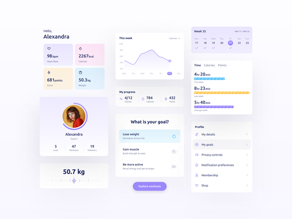
Investing in cross-platform design gives companies a competitive advantage, meeting user expectations by delivering a coherent experience across various devices. For example, a fitness app that synchronizes user data across mobile, web, and desktop platforms. It enables users to access their fitness progress and perform tasks effortlessly, regardless of the device they choose to use.
Fitness & Workout App by Elinext
Achieving a Seamless User Experience
Research
Don’t hesitate to spend some time on this first step, as it’s a key part of defining your goals and deciding on the platforms you want to invest in. Most likely, you don’t need your app to be everywhere. Well-conducted research will lead you to understand your target audience and their preferred devices; it will also enable you to focus your efforts on delivering a more impactful cross-platform experience.
To accomplish this, think about your potential users and ask the right questions, like:
- “How many people could use more than one platform or device daily?”
- “Does location impact the choice of platform?”
- “Which platforms have the largest market share and potential user base for your product?”
Conducting user research allows you to gain valuable insights, ultimately saving time and resources.
Consistency
Having a consistent interface in your cross-platform app is of paramount importance for an optimal user experience. The representation that includes consistent UI and interaction design, performance, and features will make it easier for individuals to navigate and utilize the product effectively. This key factor promotes a sense of continuity and reduces learning curves, ultimately leading to increased engagement and loyalty among users.
Designers must balance with native layouts and patterns to achieve appropriate consistency.
Adaptability
Creating a product for every device can be challenging due to complex UI and the device’s limitations. However, this doesn’t mean that you should overlook the potential of specific devices like smartwatches, which may be highly attractive to your user base. Designers should consider that some experience extensions like notifications serve as a bridge for redirecting users to the mobile app or desktop for further actions. In such cases, considering adaptable experiences for various devices and platforms can invite new customers and even helps looking beyond your initial plans.
Accessibility
To make your app fully inclusive it’s important to incorporate features like responsive layouts, adjustable text sizes, and support for assistive technologies, making the product usable by individuals with visual or motor impairments. Accessible interface design also involves offering both dark and light modes, as colors can appear differently on various devices.
By prioritizing accessibility, businesses empower all users to access and benefit from the app, contributing to a more equitable digital environment.
Prioritization
Prioritizing information architecture refers to how you organize content and layouts to meet your user’s needs. Desktop and Smart TV users have more screen space, while on smaller devices the content should be well-structured, and therefore, prioritized. Designers need to include such UI space-saving patterns as tabbed navigation, hamburger menus, FABs, dropdowns, expandable cards, and others.
However, try to be consistent with content grouping and structuring to enhance familiarity.
Conclusion
To conclude, the cross-platform design enables users to interact with the product on their preferred platform, whether it’s a mobile device, tablet, laptop, or desktop. When expanding your product, applying a user-centric approach is fundamental. Make sure that all these new extensions and interactions create meaningful experiences that resonate with your audience and enhance overall user satisfaction.
Ready to take your product to the next level? Our expert team is here to help!


