Client
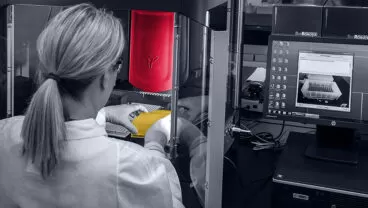
The client contacted us after seeing our designer’s portfolio on the Dribbble website. Our sales managers closed the deal, and we started to cooperate with a digital laboratory testing platform that grants patients quality laboratory testing.
Our clients are working on healthcare and diagnostics being easy and transparent, alongside being patient-led. They empower access to tests in a simple way that is comfortable for their end-users.
Project Description
Our client provides a wide variety of at-home testing services with or without physician approval, allowing people to track their health.
Their website was a little outdated and didn’t convert customers to the extent it would’ve satisfied the owners. That’s why they decided it was time to re-design it. To do this, they needed extra research from the designer, so that the website would correspond to all the best practices the competitors use.
Challenges
As we’ve already mentioned, one of the client’s requests for this project was the redesign of the outdated website to increase conversions.
Here are some of the main challenges Elinext Designer has met along the way:
- Implementing new features and design elements without the help of business analysts.
- As new requirements frequently appeared and test classifications were changed from time to time, it was required to be adaptable.
- Focus on the website being less content-heavy and easier to understand.
- Creating a UI kit for the website from scratch.
- Implementation issues for some elements of the design.
- The main page has to be fulfilled within the best industry standards
Process
Our designer had an individual approach to deliver the best solution and results. In addition, for communication with internal team members, the Agile approach was used.
That way, Elinext designer was adaptable to changing requirements, she developed the website until the design was fully completed, got instant feedback, and solved critical issues quickly.
At the beginning of the project, our designer conducted competitor research, reviewed the usability and interface of the existing website, and identified weaknesses.
Here’s the design workload that was covered:
- Research and analysis;
- Wireframing and generating design ideas;
- Creating UI kit;
- Redesigning and creating mockups;
- Creating responsive design;
- Collaborating with developers.
During the work process, Elinext employees interacted with the customer and developer on the project to constantly receive feedback at all stages of the design process and identify issues and blockers in time. Therefore, it became possible to constantly improve new features, usability, and interface.
The entire design process lasted 8 months, which included a redesign of the website, the redesign of test results in the PDF format, and email newsletter templates, as well as the redesign of online instructions.
Some design process stages were repeated from time to time because there were some changes throughout it.
Solution
Work on the solutions included the following stages
Research and analysis.
This stage included the time to understand the customer’s problems, goals, needs, and requirements. The initial problem was the outdated website design. The main goals were to create a unique and creative design and improve the usability of the existing website. The customer’s main need was to increase the conversion.
In addition, one of the essential parts was researching the industry, and target audience, and conducting the competitor analysis to highlight best practices and weaknesses to avoid making similar mistakes.
Wireframing and generating design ideas.
The next stage was to generate new design ideas for the website according to the customer’s requirements. Since the client already had a color palette and logos, our designer played around with different styles and layouts aligned with the brand identity.
As a result, our designer came up with five different options for the main page. After brainstorming these ideas with the client, the Elinext designer combined several options to find the best solution which was used for all website pages.
Creating UI kit.
While creating website mockups, the designer simultaneously created the UI kit with various components and styles. It helped her save time when she needed to make lots of changes to mockups and ensure the consistency of the website and other company products.
Redesigning and creating mockups.
This was one of the main and longest steps of the project. After reviewing the usability/interface of the existing website and coming up with the visual style of the main page, the designer started working on all website pages according to the customer’s requirements.
While implementing some pages, some issues were discovered and the designer had to return to the design stage of these pages to solve them. After solving problems and making improvements, the interface became more user-friendly and intuitive for users.
Creating responsive design.
Since many users make purchases from mobile devices, our designer has paid great attention to developing responsive designs for mobile devices. Every component and page content was adapted for mobile devices.
As a result, here is what was reached:
- The layout was simplified, the most important information was prioritized, and clear labels were used
- Consistency throughout all pages was added
- Visual images and videos were added
- The quality and easy-to-understand content was created
- Clear navigation and CTAs were added
- The website was optimized for mobile devices
Main features for the product page that were re-designed by the Elinext employee.:
- Test type selection
- Additional offers selection
- Test guide
- Examples report
- Labels
- Info about tested items
Results
The project is completed at the moment. There weren’t exact deadlines on the entire project, since during the work on the design, requirements were changed and new tasks for other products related to the website were added.
In this project, we focused on the quality of the design solutions that will help increase the conversion and profit of the company in the future. As a result, the customer was satisfied with both the process and the result of the work.
The main achievements reached by this project:
- New design that meets requirements;
- User-friendly interface;
- Simplified and intuitive purchasing process;
- UI kit that can be used for all company products;
- Various solutions for some elements;
- Except for the website redesign, test results in the PDF format, email newsletter templates, and online instructions were redesigned.
That indirectly leads to:
- Increasing the number of users;
- Increasing sales and conversion;
- Increasing company profit.
As many features had to be implemented by web developers, these tasks should take some time, and upon their completion, we were promised to get back with cooperation on their new projects, which says a lot about customer’s level of satisfaction with our efforts.
