A large electronics retailer from Germany hired Elinext to help it develop its eCommerce website.
Challenge
Our relationship with this client began with a small assignment: to build a brochure generator tool. Through that job, we proved ourselves a reliable partner and were given a bigger project.
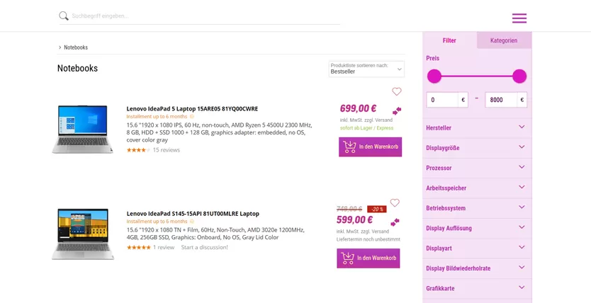
The bigger project was all about improving the retailer’s website in its desktop and mobile versions. The client wanted to make changes to several product pages but lacked programmer hands to do that. Naturally, they reached out to the developer they had previously successfully worked with for help.
Solution
We joined the project team as external members. The in-house part included a project manager, a product owner, and three senior-level developers. As a cohesive squad, they worked to scrum methodology with a few specifics that had to be adopted.
First of all, the client used the “manage closely” approach, which meant our developers worked closely with their project manager. We adopted their workload management model, ensuring that no team member ever stood idle.
Overall, the project has been about close collaboration from day one. We have been exchanging ideas with the client’s team, suggesting improvements and fixes. Most of our suggestions have been either put to work or stored in the project’s backlog. And some of those suggestions translated into the development of major new features.
Product Bundles
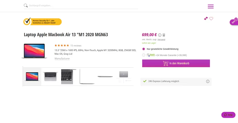
The client first requested we add a special offer on a product’s page: an antivirus program at a discounted price with a particular notebook purchase. The task was an easy one, but come next special offer, we or the client’s team would have to do it again.
We suggested developing a tool that would allow website admins to add similar discounts without engaging programmers. The client loved the idea and greenlighted it right away.
We developed a new section in the admin panel called product bundles. A typical product bundle is a combination of an expensive product and a much less expensive one that is offered at a lower price.
A website admin creates such a bundle, selects both products, and sets the discount rate. In addition to particular products, they can add special offers for specific product categories and brands.
A customer sees the discounted items on the main product’s page. If they add the main product to their cart, the discounted items will go in there too. The customer can remove those before checking out.
Mask Images
Mask images mirror what product bundles do. Product bundles show which items you can get at a discounted price or even for free when buying a particular notebook, for instance. With mask images, you will see what notebook you can buy the item you are viewing with to get that discount. We are still developing this feature.
Processor Logos
Our client works with processor and video card manufacturers. Those brands required their logos to accompany every item that included their products. The client initially wanted us to code those logos into the website.
Again, we suggested an alternative the client loved. We developed another section in the admin panel allowing admins to add a manufacturer’s product logo to all items with that product on the board. No coding is required, no need to waste developers’ time.
Brand Pages
Some of our client’s brand partnerships transcended product logos as major brands wanted to tap into the popularity of the retailer. We improved brand pages to feature their products, product guides, news, demo videos and other promotional content.
Item Comparison
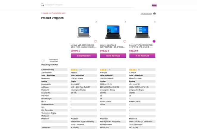
The sheer variety of notebooks and similar technical products for sale, each defined by a range of technical parameters, often spells choice paralysis for shoppers and stops them from buying. To help remove that block, the client requested us to develop a comparison page.
The feature we built works as a page that opens in a new window when you click “Compare” next to the item image. The item will appear in that window with its parameters listed in a column. Go to another product, click “Compare” on its page, and it will appear next to the first one. You can add several items to the comparison page.
Review Filter
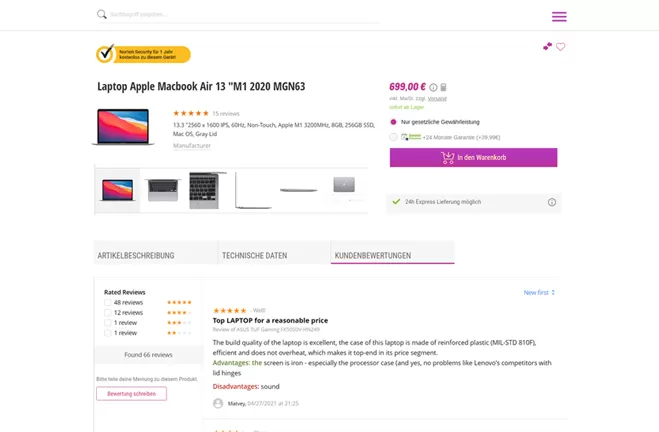
Every item page on our client’s website includes a review section. Some items had dozens of reviews successively listed as they were published. We built a filter that made navigating reviews easier. Users will soon be able to sort them out by relevance, date of publishing, and rating.
In general, we had to be extremely cautious working on this project. The client is a well-respected brand, and any disruptions in customer experience could damage its reputation. We reviewed our work with each iteration, checked each task manually, and ran automated tests, using Postman for APIs and Jest for the front end.
Result
We have completed all tasks on this project in due time while staying within the budget. The client has been ecstatic about the improvements we have suggested to simplify things, lifting the load off the IT department. But they also liked how responsive we have been and the way we focused on consumer and business needs, rather than just the technology.
Elinext continues to work on the project. Tasks are stacking in our backlog, and we anticipate even bigger changes in the client’s product.

