Challenge
The entrepreneur set out to build a time-tracker for his own needs. As he was drafting the prospective app’s design, the wannabe app founder gradually realized it could do more than that.
He was really inspired by the likes of Warren Buffet and Elon Musk. Their efficiency and versatile minds fascinated him, so he studied those entrepreneurs’ lifestyles and thought: “Why can’t we all adopt their habits?” And that question turned the idea for a time-tracker into a lifestyle app idea.
Building a product like that required relevant expertise in mobile development. Moreover, the entrepreneur was on a budget, so the project required a creative, cost-efficient approach. As a developer experienced in startups, Elinext came across as a natural choice for the job.
Solution
Our target was to build an app that would work on both iOS and Android. But native development for each operating system would cost too much for an MVP with uncertain prospects. The best alternative we could find? Building a cross-platform app with React Native, of course.
The client outlined the features he wanted with the app so we could estimate the price and time to build them. Together, we worked out a roadmap, assigned two developers well-versed in React Native and the project began.
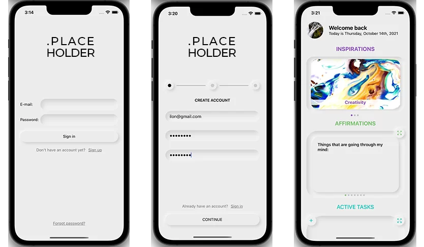
The app’s concept is built upon three modules: inspirations, affirmations and tasks. Here’s how we approached each of them.
Inspirations
Mindfulness can help you make the most of any activity, be it work, meditation or having a meal. Drawing on that point, the client came up with the idea for the Inspirations module.
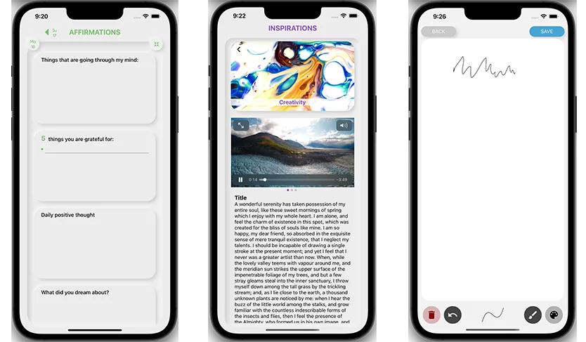
When you log in, the Inspirations module is the first thing you see. It’s a screen section dedicated to videos tailored to different situations. You can swipe those videos to find the one most appropriate for the moment.
The most cost-effective way to enable that feature was through Vimeo. We integrated the service with the app via APIs and set up an admin panel. The client can use the panel to upload new videos to their Vimeo account and write titles and descriptions for them.
There was one problem with those videos: they were hours long. That meant users would have to wait several minutes for the entire file to load if they wanted to watch it from a particular time. It also sucked a lot of mobile data, which made using the app expensive.
We fixed that by setting up adaptive streaming. It requires no buffering, so videos load fast and only as much data is used as necessary.
Affirmations
Right below Inspirations, you will find a kind of diary called Affirmations. You can use it to write down your thoughts, ideas and indicators (e.g. your weight) to track changes over time. And if words fail you, you can express your thoughts with a drawing.
We enabled users to revise their Affirmations. Just go to the calendar and find a particular day in the past. Or search for records by keywords and tags.
Tasks and Sessions
Tasks and Sessions is probably the most complex and utilitarian feature of the app. Tasks fall into three categories: inbox, active tasks and latent tasks.
Inbox is a section where you can create ideas for tasks you haven’t yet decided what to do about. Later, you can convert those ideas into active or latent tasks.
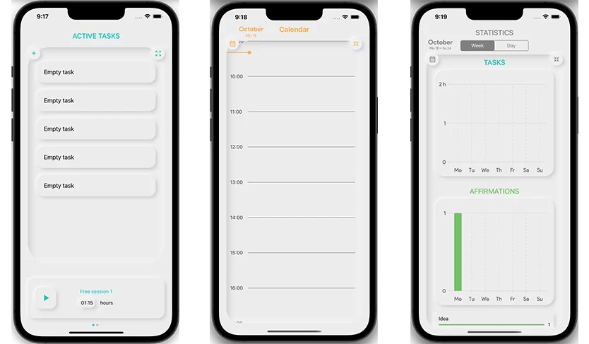
When creating an active task, you can configure a bunch of parameters. Make it a one-off or recurring task, specify how much time it should take, assign a priority level, set dates and add a tag.
There are two types of recurring tasks: routines and drills. Routines are tasks you choose to be repeated daily, weekly or monthly — to build a habit or remind yourself of rare but regular business. But drills are more sophisticated. They draw on spaced repetition, a learning technique where you repeat the same action less often as you learn to do it.
Latent tasks are different in that you create them for the future. You set a start date, and, on that date, the task will automatically become active.
You may be wondering what the priority levels are for. But that’s a really smart feature. You can combine multiple tasks in a session where the session time is allocated to tasks based on their priority.
For example, it’s 2 pm and you have a meeting at 5 pm. In these three hours, you want to read a book and jog.
You create a session time block for three hours and add tasks to it accordingly. If the priority level for reading is 7 and that for jogging is 4, the app will allocate about 2 hours to the former and 1 hour to the latter. It will notify you when it’s time to move from one task to another.
Calendar
The overarching feature, a core around which everything is built, is the app’s calendar. You can use it to:
- create, schedule, view, and edit your sessions;
- view your affirmations and tasks, both completed and scheduled;
- check events pulled from other calendars (e.g. Google Calendar, Apple Calendar) to better plan your day.
Each day on the calendar is presented as a timeline of scheduled activities and events. You can use pinch gestures to zoom in to see a specific record and zoom out for the bigger picture.
What made building the calendar a bit of a challenge is lots of animation and dynamic calculations. We had to configure a system where events are automatically placed across the timeline in a way they don’t overlap each other.
Productivity and Motivation
The app is more than a planner — it’s a productivity tracker. First of all, it has a statistics section with graphs showing you how many tasks you have done within a selected period of time.
But we also introduced an element of competition. For each completed task, you receive a point. The number of points you received over a day, week, month, or year ranks you against other users. You can check your position on the rank screen.
Usability
The client thought the concept of the app might be unclear to new users. To help them get on board fast, we introduced an interactive guide mode. In this mode, users are shown suggestions, explaining how each module or feature works.
We also enabled users to create multiple accounts. Why? For example, you may want to separate your private activities from your family routines and manage the latter in collaboration with your partner. To do that, you just set up a private account and a family account with shared access.
To further streamline the user experience, we enabled an offline mode. If you use the app without an internet connection, your records will be uploaded to the server once you’re back online. And if you or someone else deletes a record, you can recover it by rolling the app back as far as three days before.
Result
It took us a little more than a year to build the early version of the app. Elinext helped the client submit it to a platform for early adopters, and the app is now gathering user feedback. By using that feedback, the client plans to find the best monetization model and pitch the product to investors.
